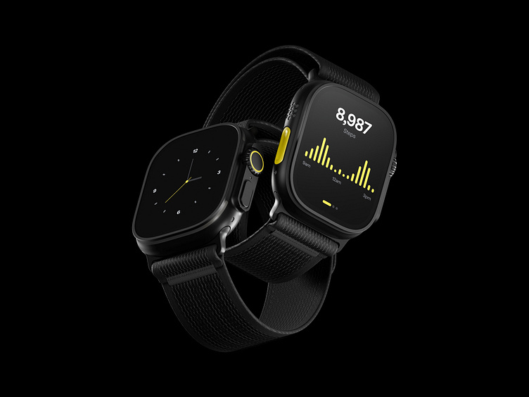
Smart Watch Explorations
In this design exploration, I set out to address common UI/UX issues, particularly in the context of smaller screens, like those on smart watches. My focus was twofold: experimenting with the often-maligned color yellow as a primary branding element and rethinking the user experience for such compact interfaces.
Color Experimentation:
Enter your text I chose yellow for the UI, a color widely considered one of the worst for digital design due to its poor readability in many shades. However, I believe that the real issue lies in the selection of inappropriate tones and the attempt to use it in the same way as other colors. By carefully curating the shades of yellow and using them purposefully, I believe it can work well, even enhancing the overall aesthetic when applied thoughtfully.here...
UX Optimization for Small Screens:
Smart watches are inherently limited by their small interfaces, and expecting users to engage in complex interactions, such as scrolling or navigating menus, is impractical. My goal was to create a UI that is minimal and functional, delivering only the essential information at the right moment with zero distractions. The design avoids over-complicating the user experience, acknowledging that the smart watch should serve as a quick, glanceable tool rather than a phone-like device.


