Haast Solution - Pricing Section UI UX Design
About Haast Pricing Section Design:
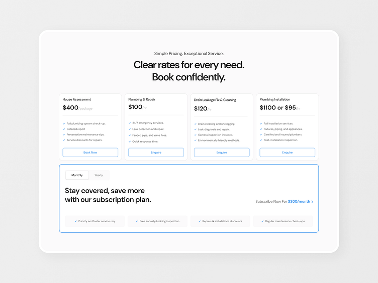
After carefully interviewing my client about their selling process and preferences, it was clear that their customers wanted both fixed pricing services and a subscription plan. However, the challenge was to present these together in a way that didn't confuse users.
The client wanted to emphasize the subscription plan while keeping fixed-price services clear and easy to compare. The goal was to design a layout that drew attention to the subscription without overwhelming the user.
After doing my research and testing various designs, I created a layout that keeps the fixed pricing options in a clean row, while placing the subscription plan separately with a subtle stroke around it. This stroke adds just enough emphasis without being too aggressive.
Using visual hierarchy and whitespace, I ensured the subscription plan stood out, yet everything remained clear and organized. The design reflects the client’s selling process, guiding users naturally between services and subscription options.
PS: I also revamped their existing logo. Want me to post about that? Here's a sneak peak 😊
I hope you guys like it ❤
Follow me for real daily app and web design inspiration ✨
Have a project?
Email me at: sameersidd.design@gmail.com or message me on Dribbble!
That's All Folks!
Become a part of my community to learn more about UI UX and my journey as a freelancer.


