OMO responsive
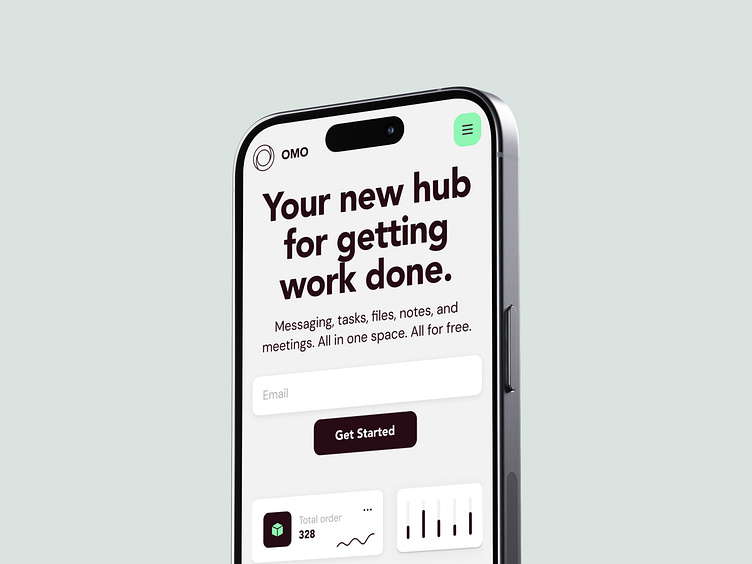
After thorough research, our team identified the core challenges faced by modern professionals. Managing multiple apps for messaging, tasks, file sharing, and meetings was not only overwhelming but also inefficient. To streamline these processes, we developed a responsive website that integrates essential work functions into one cohesive platform, ensuring a seamless experience across all devices.
Key Challenges:
• Fragmented workflows across various tools;
• Difficulty in team collaboration due to dispersed communication channels;
• Time lost switching between multiple apps.
Our Solution:
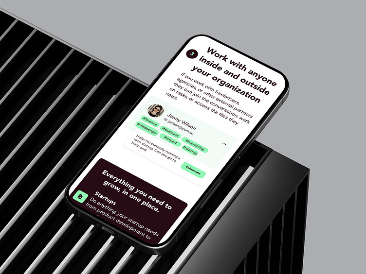
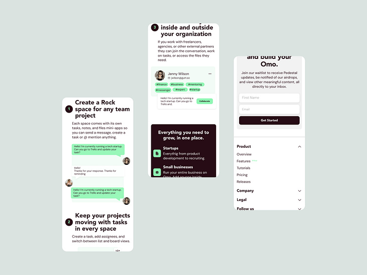
• A responsive, unified platform that combines messaging, tasks, file sharing, notes, and meetings in a single place;
• Enhanced team collaboration, with real-time project tracking and management within one space, accessible on any device;
• Increased productivity by reducing the need for app-switching, allowing users to focus on what matters;
The design, optimized for both desktop and mobile, employs a two-color scheme that maintains simplicity and focus. This minimalistic approach emphasizes OMO’s functionality and ease of use, ensuring that professionals can work efficiently with fewer distractions—no matter where they are.
This version highlights the responsive design aspect, emphasizing seamless functionality across various devices.
⭐️⭐️⭐️
We’re always excited about new projects!
You can find our contact details in the About section of our profile.