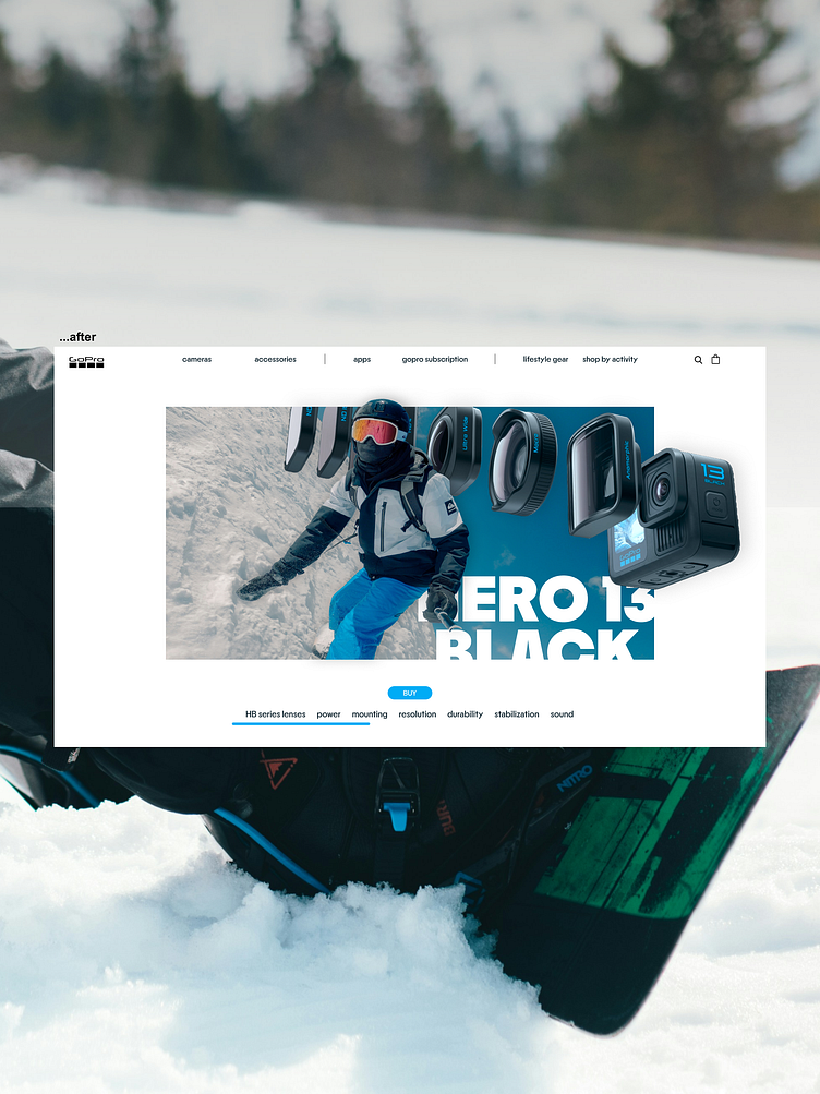
GoPro Website's redesign - concept
Do you think GoPro needs a redesign of their website?
This is a winter edition, making the website eye catching, modern and minimal.
↳ the navigation has been improved and simplified for a better navigation
↳ the center of the design is more eye catching and sport focused
↳ the buy button is more clear and the colors make the UI more clear
More by MPIKO View profile
Like
