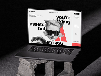
Bold Visual Identity for Blockchain Conference
Ready for another reveal? This time, we're spotlighting the bold brand identity behind u.lecture, showcasing how consistency reigns supreme across every touchpoint!
From the streets to your wardrobe, u.lecture's visual language stands strong—bold typography, striking imagery, and a rebellious edge. Just check out those sleek merch pieces and attention-grabbing banners.
Whether it’s a bag or a billboard, the brand’s messaging hits hard: unlocking potential is key.
The consistency here isn’t just a design choice—it’s a statement. Every element, and every placement reinforces the brand’s powerful narrative and invites you to explore blockchain's untapped potential in style.
Kudos to
Yana Shvedyk — Concept idea, UX/UI design
Oles Pasychnik — Animation
________________________________
Do you want to capture customers' hearts and conquer the market?
Let's add some Qream on top: collab@theqream.com


