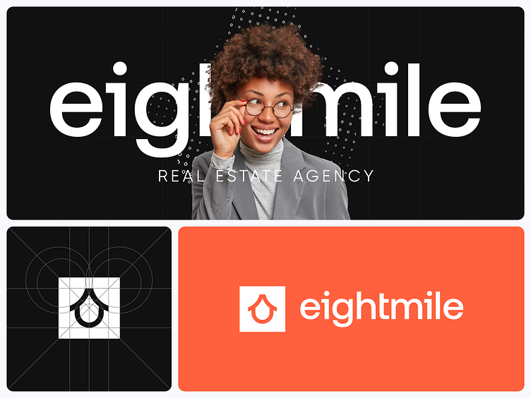
8mile - real estate agency logotype
The eightmile logo is a unique symbol that combines the image of a house with a stylized number 8. This symbol reflects reliability, innovation, and modernity—key characteristics of the company that convey its core business direction.
The main element of the brand is a dynamic pattern created from the eightmile logo. This pattern symbolizes the fast-paced nature of the real estate market while serving as a visual identifier of the company's brand identity.
The primary colors are yellow and orange, which evoke a sense of boldness, positivity, and energy. The use of black and white adds a touch of sophistication and professionalism, while a sky-blue color introduces an element of lightness and freshness.
The chosen color palette and graphic design solutions contribute to building a unique and effective brand identity across both online platforms and offline services.
hello@outcrowd.io
outcrowd.io
We ensure your brand image won't get lost in the market noise.
With design and branding, Outcrowd helps reveal your brand's essence and build products that attract users, impress investors, and drive breakthrough growth.
Become a part of Outcrowd communities:


