Healthcare Dashboards That Aid Accurate Decision-making
A must-have attribute of every healthcare dashboard is that it should be a one-stop-shop for high-level, contextual information in real-time. Effective dashboards provide a comprehensive overview of patient health data, prioritizing clear visualizations of key metrics, customizable layouts for individual needs, and real-time data updates.
The objective is to display information in an optimal manner to enable its users to make quick, informed decisions and not be inundated with irrelevant data.
Check out these examples -
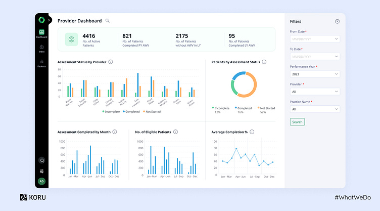
1. Designing a comprehensive overview
This dashboard displays a comprehensive overview of the patient assessment, their status, month-wise assessment status, completion percentile, and number of eligible patients. Each category’s graph is designed to provide further information and track progress at a glance.
While depicting a clear overview is a priority, it is equally important to highlight scenarios where an intervention may be required.
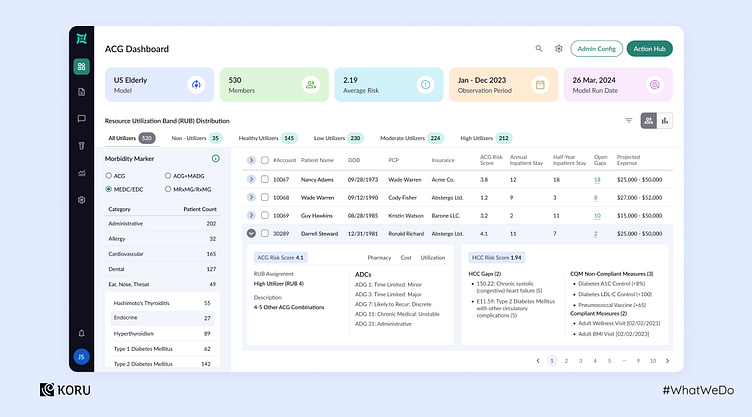
2. Creating the right filters
Time is of the essence when it comes to designing the functionality of a healthcare dashboard, and so is the context of the information provided.
The dashboard below provides multiple filters for RUB distribution. The panel on the left provides the option to pick the morbidity marker. Clicking on the pointer next to a patient’s name provides details of ACG and HCC risk scores.
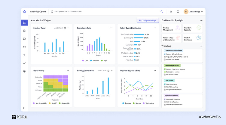
3. Simplyfing an analytics dashboard
An efficient analytics dashboard is one that provides a no-fuss view of the current status and helps users to view and track progress of different data points. As seen below, this analytics dashboard provides an overview of the pre-selected widgets. Users can select or drag and drop a widget of their choice to be displayed in the overview.
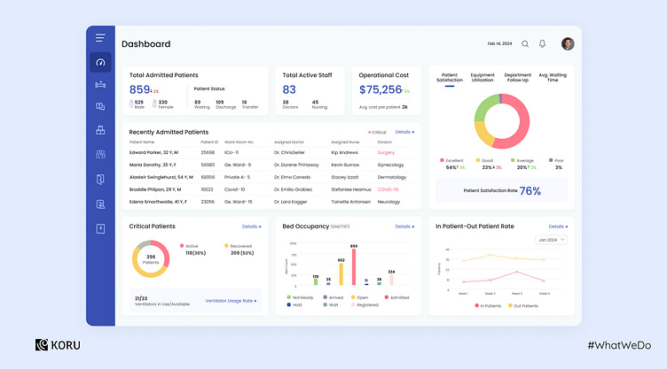
4. Hospital management dashboard for improved decision-making
A good hospital management dashboard helps resolve the complications of paperwork arising from all the departments of the hospital. It provides a no-fuss view of the current status and helps to cover everything in simple intuitive clicks. It can maintain & manage patient clinical records, track bill payments, and monitor inventory supplies as well.
This dashboard provides an overview of the main parameters - patients admitted, active staff, and operational costs at the top. This is followed by the next priority item, i.e., the date-wise list of admitted patients. The bed occupancy graph is color-coded and can be viewed in a detailed mode.