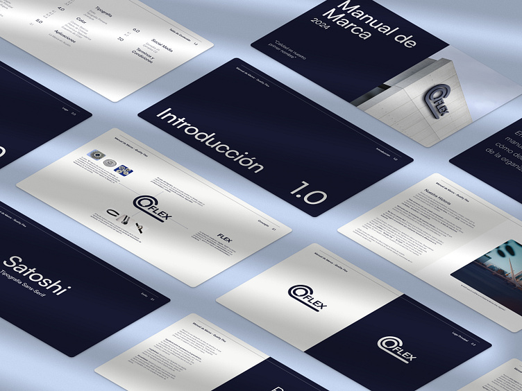
Brand Guidelines Q-Flex
Case Study: Q-FLEX Brand Identity
Clients: Erik Tverdovsky and Nicolás Vadra
Role: Graphic Designer and Brand Consultant
Service: Visual Identity Development and Brand Guidelines
Project Overview: The primary objective of this project was to create a robust and memorable brand identity for Q-FLEX, a leading supplier of polyethylene and synchronous belts in Argentina. A comprehensive visual identity was developed, including a logo, color palette, typography, and style guide to ensure consistency across all brand communications.
Challenges
Understanding a highly technical market.
Creating a brand that appealed to both industrial clients and end consumers.
Developing a distinctive visual identity in a competitive market.
Methodology
In-depth market research to understand the industry and target audience.
Competitive analysis to identify opportunities for differentiation.
Development of a brand strategy and positioning statement.
Creation of a visual identity system, including logo, color palette, and typography.
Development of brand guidelines to ensure consistency.
Results The project successfully achieved its goal of creating a strong and memorable brand identity for Q-FLEX. The new visual identity has been well-received by both industrial clients and end consumers, and has contributed to increased brand recognition and customer loyalty.
Key Takeaways This project highlighted the importance of in-depth market research in understanding the specific needs and preferences of a target audience. Additionally, the iterative design process allowed for continuous improvement and refinement of the brand identity.
