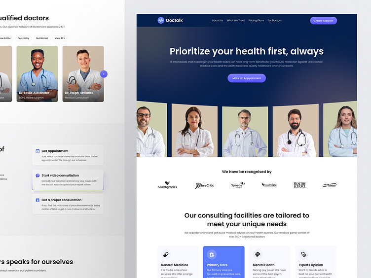
DocTalk - Telemedicine Landing Page Design
Overview:
The DocTalk landing page design focuses on simplifying the process of accessing healthcare services through a telemedicine platform. The platform connects users with health experts for consultations, appointments, and ongoing health management. The UI design is clean and user-friendly, guiding visitors through essential features like appointment booking, pricing plans, and doctor consultations.
Challenge:
With the increasing demand for accessible healthcare, especially post-pandemic, DocTalk needed to create a digital solution that bridges the gap between patients and healthcare providers. The challenge was to present an array of services in a simple, visually appealing way without overwhelming users with medical information.
Key challenges included:
Designing a UI that highlights telemedicine benefits while ensuring ease of navigation.
Structuring complex healthcare data like doctor specializations, pricing, and appointment systems in an intuitive layout
Ensuring trustworthiness through patient testimonials, clear service explanations, and displaying key metrics.
Objectives:
User-Centered Navigation: Provide a seamless, intuitive experience for users to find and schedule appointments, access different plans, and consult with healthcare professionals.
Trust & Credibility: Showcase patient testimonials and doctor qualifications to enhance trust in the service.
Service Differentiation: Highlight the range of services offered, such as general medicine, mental health, and primary care, to demonstrate the breadth of expertise available.
Clear Call-to-Action: Drive conversions with prominent "Make an Appointment" and "Get Appointment" buttons that guide users to the desired actions.
Outcome:
The final landing page delivers a well-structured interface that clearly communicates DocTalk’s value propositions. The combination of patient testimonials, service descriptions, and accessible pricing plans successfully builds trust and encourages engagement. Users can easily navigate through sections to book appointments, subscribe to plans, or learn more about the doctors available on the platform.
Key results include:
Increased user engagement with clear CTAs.
Enhanced trustworthiness through testimonials and ratings.
Improved conversion rates due to a streamlined booking system and pricing plan comparisons.
Let’s build your project together! 🤝
sourovhaldar8@gmail.com
_
Follow me on
Facebook l Instagram l Linkedin
-


