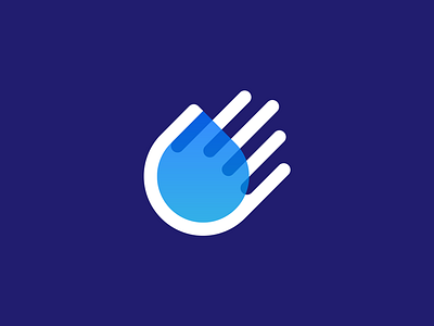
Water Hand
Water Hand Symbol.
Refined concept. Highly appreciate all your input so far!
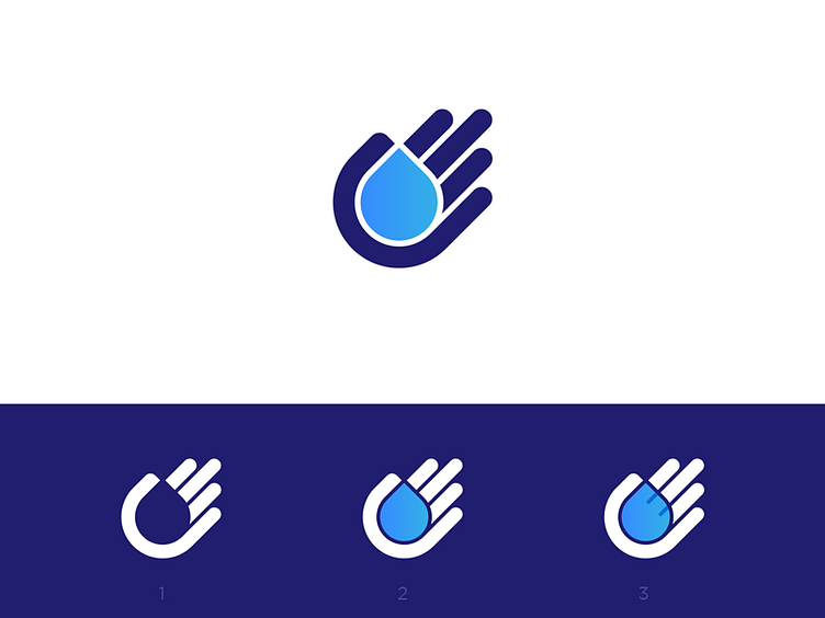
Made the inner spaces a little less wide and placed the drop just a little better so it felt more in balance. 3 options on how to use this mark. Which one do you prefer and why?