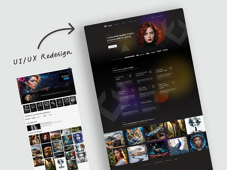
User Interface & Experience Redesign of tengr.ai Landing Page.
An example of an outdated UI design, featuring cluttered elements, inconsistent typography, and an overall confusing layout. The navigation lacks clarity, making it difficult for users to find what they need. This design highlights the challenges of older interfaces that haven't been optimized for modern user needs.
Revamped UI with a focus on modern UX principles, presenting a clean and user-friendly structure. The navigation is intuitive, allowing users to easily find their way around. Consistent typography, well-spaced elements, and a clear visual hierarchy ensure a seamless and pleasant user experience, making the interface more accessible and efficient.
More by Daniel Barta View profile
Services by Daniel Barta
Like


