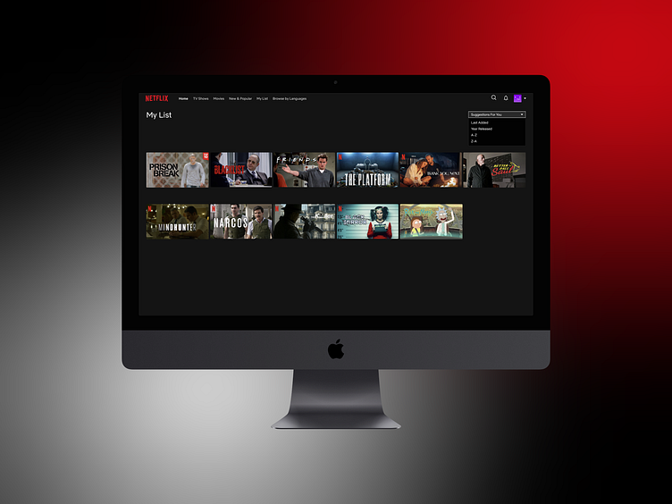
Netflix "My Lists" Redesign
In this case study, I redesigned the "My List" feature of Netflix to enhance user experience by addressing significant pain points related to content organization. The main improvements include creating a dedicated section titled “Suggestions for You” and introducing a dropdown filter that allows users to sort their saved titles by Last Added, Year Released, A-Z, and Z-A. These enhancements aim to provide users with a more organized and efficient way to manage their content, ultimately fostering a more enjoyable viewing experience.
More by Duygu Caglayan View profile
Like


