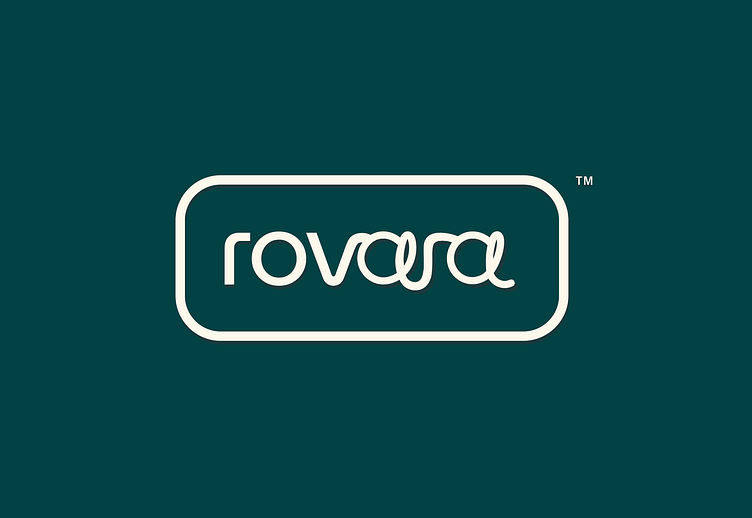
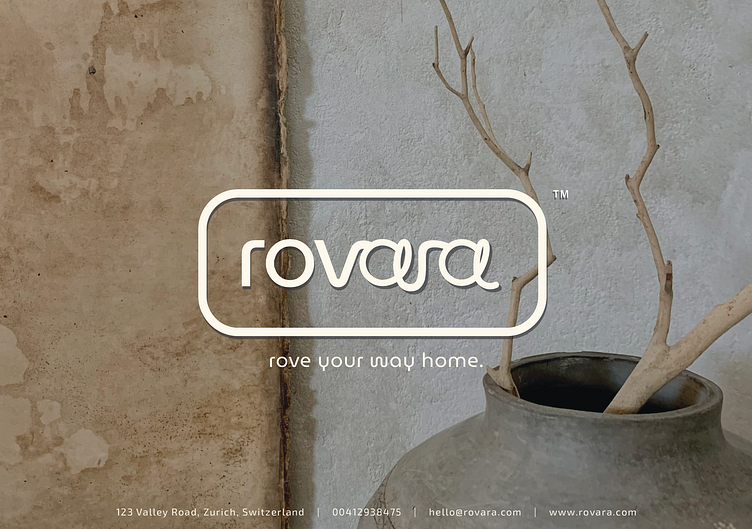
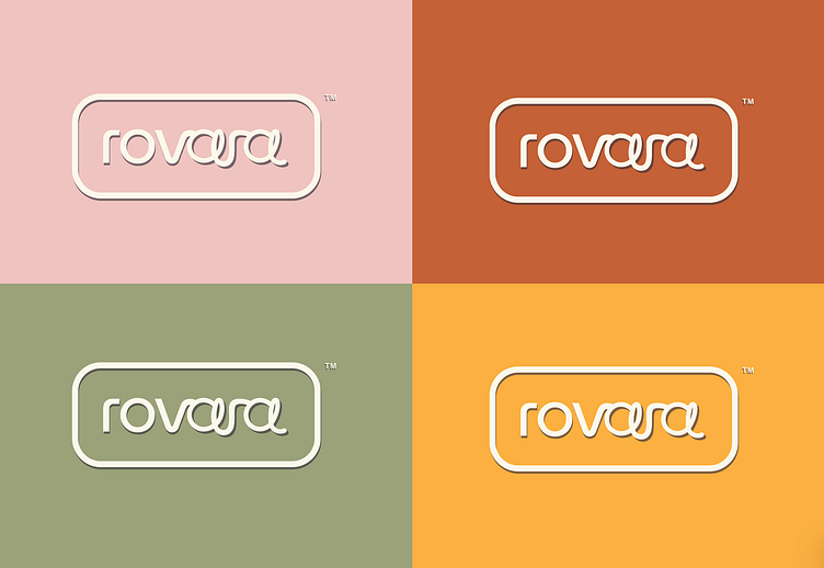
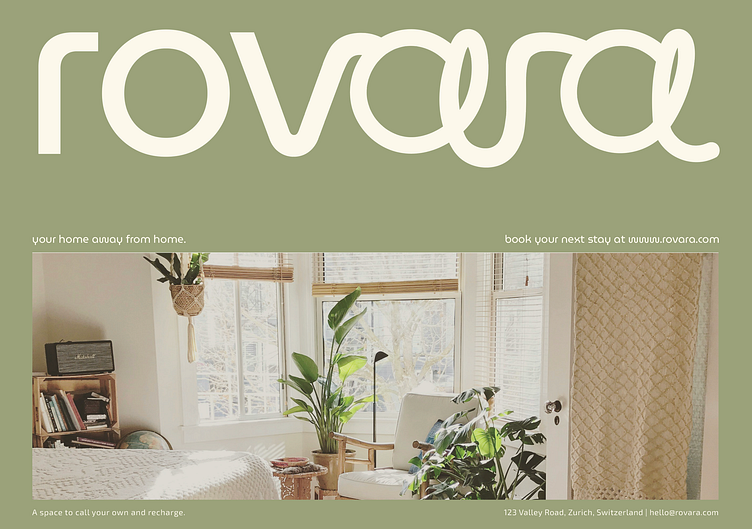
Logo Design & Brand Identity - short term real estate rentals
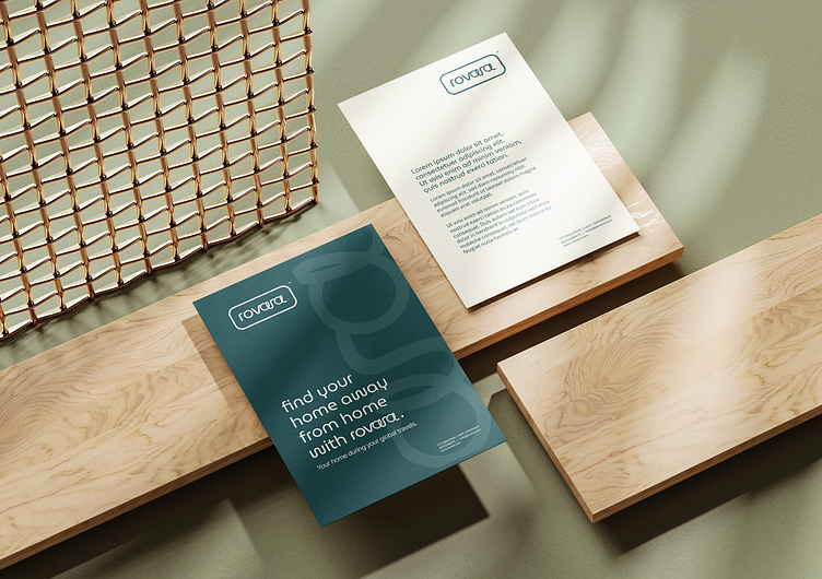
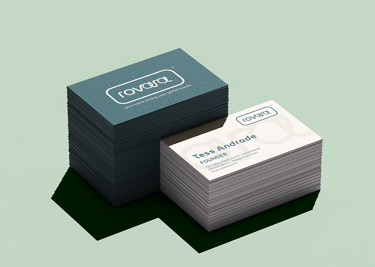
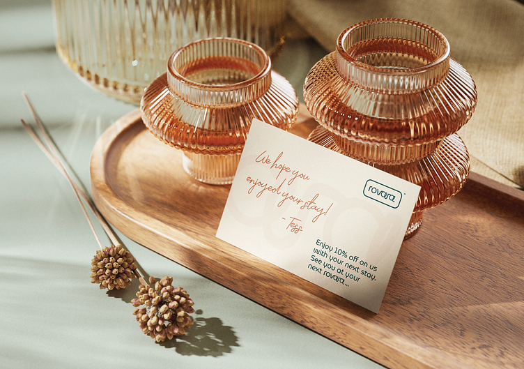
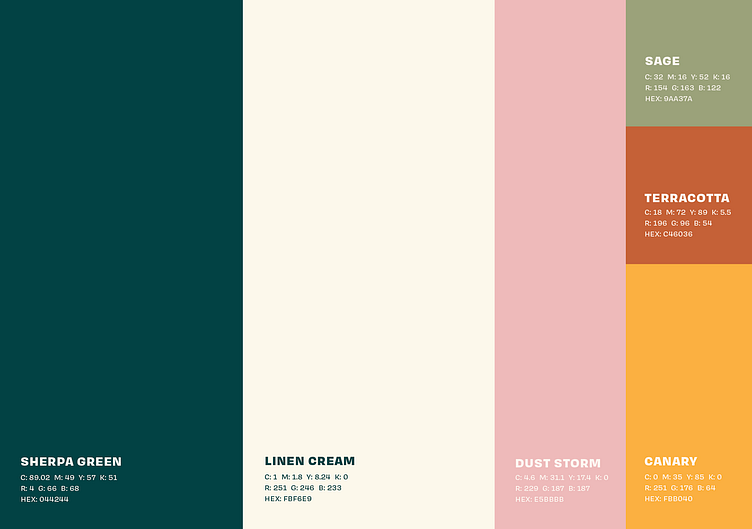
An awesome Switzerland-based client I worked with requested a sleek, modern logo design with a bohemian twist to it for her short-term rentals brand directed at travelling professionals and digital nomads. I brought in a fresh, warm and bold colour scheme to soften the brand to be approachable to both individuals and corporate partners.
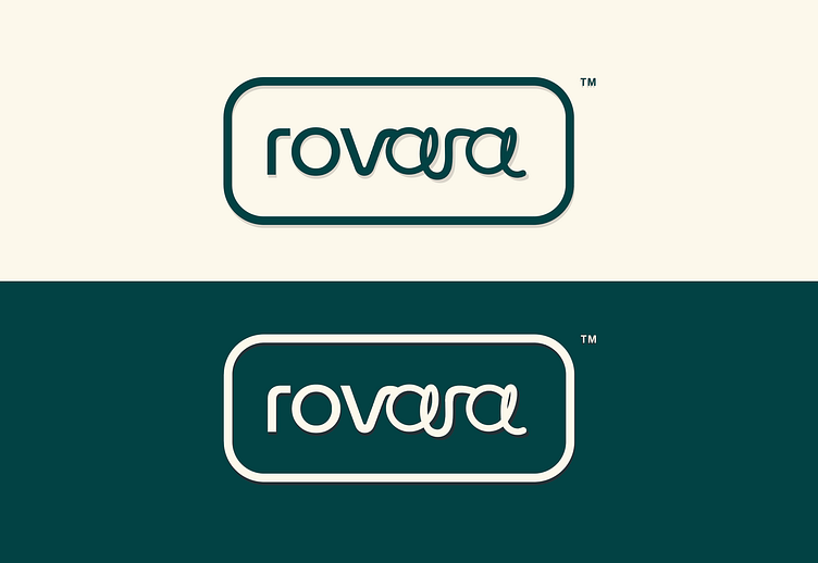
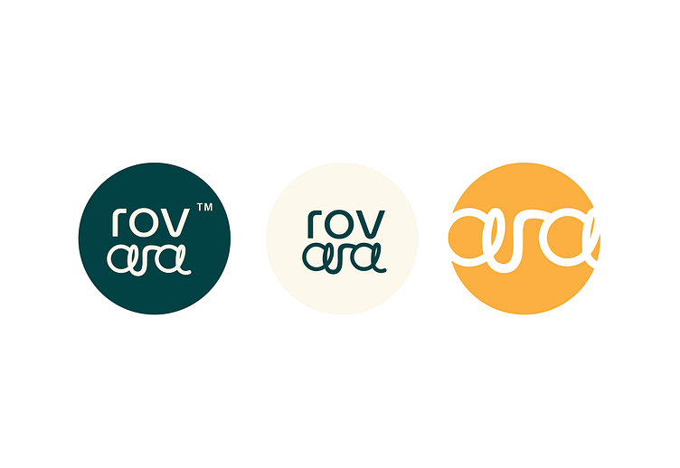
The more rigid "rov" represents the origin of the word to 'rov' or move around; with the more free approach to "ara" showcasing the element of comfort and relaxation associated with Rovara properties.