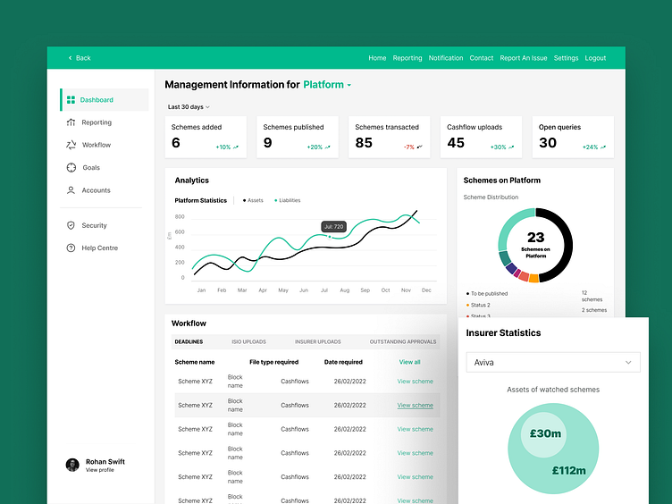
Affordable B2B Insurance Solution
An award-winning platform for investment management
Solara (changed for confidentiality) lowers insurance costs by pairing clients with insurers that meet their price goals.
The problem
Solara needed a comprehensive redesign to align with its evolved brand identity and incorporate new features. The challenge was to create a seamless user experience for a complex product, ensuring usability for users to easily navigate and understand its functionalities.
The solution
To address the redesign of Tōshi, I conducted user research to identify pain points and gather insights on user needs. I created an intuitive interface that simplifies navigation and enhances usability by incorporating a robust search function, improved filters, and an interactive table. I also unified the action menu to streamline user interactions, removed visual clutter, and made the overall interface cleaner. By prioritizing user feedback throughout the design process, I ensured that the final product aligned with the brand identity and provided a seamless experience for managing complex scheme functionalities.
B2B | Web App | Fintech


