Day 01 - 70Rad Design Challenge
Modern Landing Page UI - 70Rad Design Challenge
Here’s my Day 1 design for the #70RadDesignChallenge
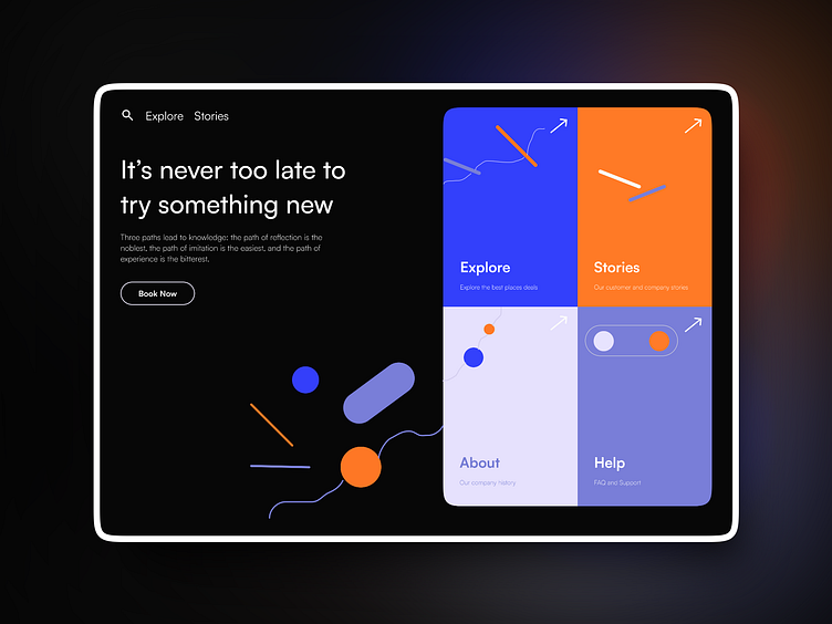
This minimalist landing page is designed to inspire users to explore new opportunities. The left section features a bold motivational quote, “It’s never too late to try something new,” along with a clear call-to-action button for bookings.
The right section breaks into four interactive areas—Explore, Stories, About, and Help—each visually distinguished with vibrant blue and orange accents.
Key design elements include a sleek, dark background to make the bright UI components pop, modern typography for readability, and abstract shapes to add a playful yet professional touch.
Created in Figma. Let me know your thoughts on the use of color contrasts and layout balance!
Need help with your project? 📧 Contact me: dwivedianuraj@gmail.com
More by Anuraj Dwivedi View profile
Like


