Knot.dating Logo Process
Project Description
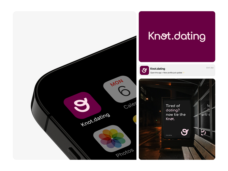
Knot.dating is an invite-only matrimonial service that helps accomplished individuals find the right partner, and it’s completely private. Their mission is to make Knot.dating the go-to platform for finding your perfect match, so you can focus on building your career!
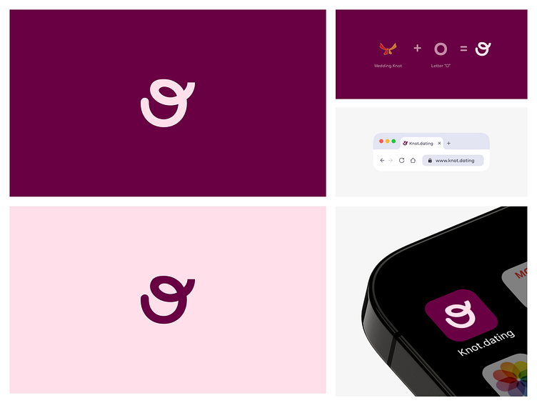
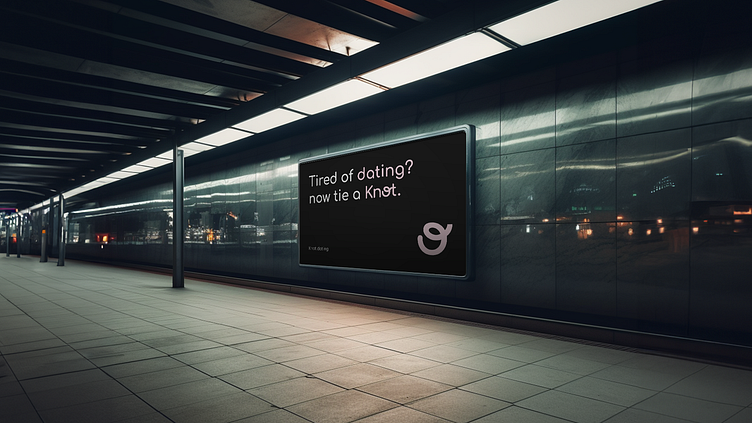
The logo was inspired by a wedding knot, symbolizing unity. The colors were picked to spark feelings of love and care. It’s a simple yet strong reflection of what Knot.dating is all about – Tired of dating? Now, tie the Knot!
The project was a rollercoaster because the initial brief wasn’t clear; they only wanted a logo for the brand, which was challenging. However, I created many iterations, and one thing was clear to me: the logo needed to represent the 'Knot' I believe I achieved that.
It took me 2 days to complete the project.
Logo Design Process
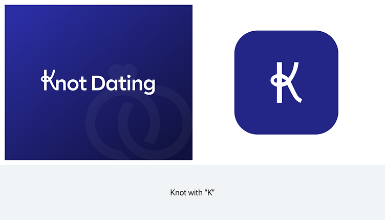
Okay, I misplaced my sketch. I tried finding it, but it’s lost. Before deciding on the knot design with the 'O,' I was initially more inclined to go with the knot design using the 'K.' I've attached the reference, but something was missing, and I couldn’t figure out what. I think maybe I chose the wrong font and colors. Anyway, it took me several iterations to come up with the knot design using the 'O.'
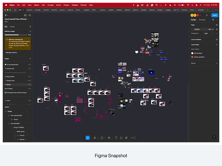
This time, I didn't have the time to create a Moodboards. If I had decided to make one, the process would have been much easier, but I drew a lot of inspiration. Here is the Figma snapshot.
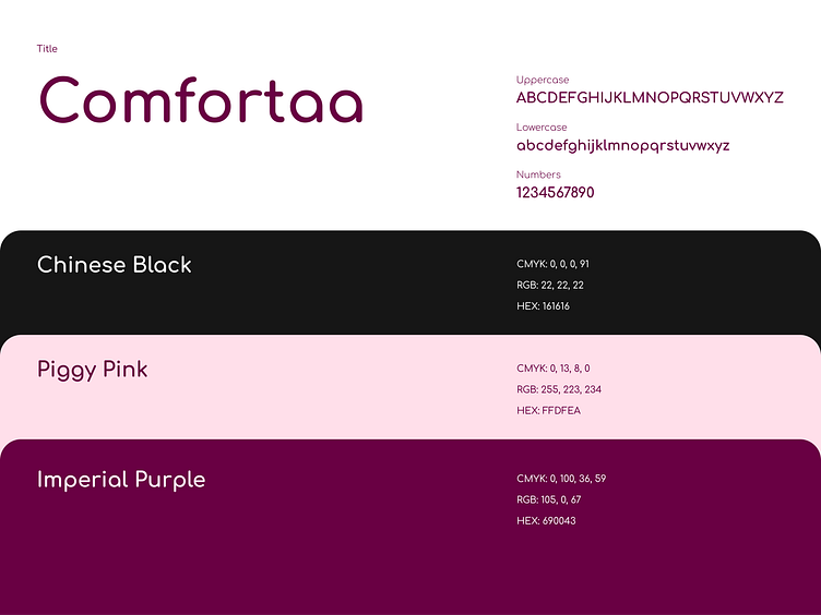
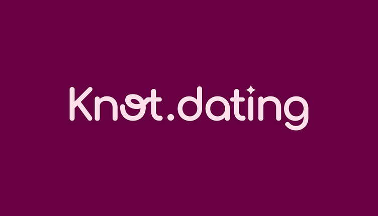
Typography and Colors
These are the colors and typography that were selected for the logo.
Loader state animation
See it live here → https://knot.dating/
Btw the website is also designed by me.
