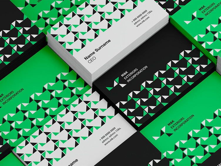
M&K EXTERIORS INCORPORATION
Our concept of visual identity for M&K EXTERIORS INCORPORATION features a modern and minimalist design with clean, geometric shapes. The "M&K" initials are formed using interlocking triangles, creating a sense of movement and energy. The overall design conveys a sense of professionalism, reliability, and innovation, reflecting the company's commitment to excellence in exterior home improvement.
More by Smart Web • Digital Agency View profile
Like


