Travel App Design
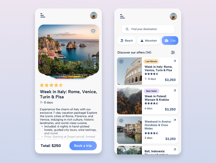
Design example of two core screens for a travel app, focusing on user-friendly navigation and clean, modern aesthetics.
Trips Screen: Displays a curated list of travel options with engaging visuals and essential trip information at a glance.
Trip Details Screen: Offers comprehensive details about each trip presented in an intuitive layout.
These designs aim to enhance the user experience by balancing functionality with visual appeal.
Tools used:
- Figma
- Photoshop
More by Aleksandra Kosyl Melo View profile
Like

