Pegatanke's Website Design 🎨
Welcome to our exploration of the Pegatanke website, where vivid design meets functional elegance, creating a digital environment that mirrors the strength and versatility of their products. 🌟
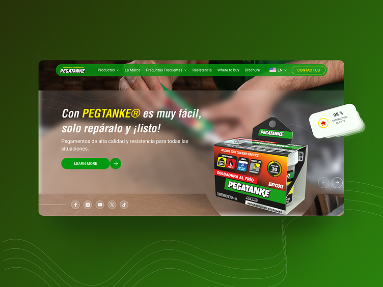
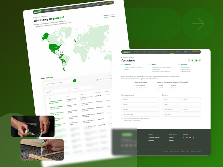
The site greets users with a striking hero section, utilizing a vivid green color scheme that resonates with Pegatanke's brand identity. This choice not only reinforces the brand's theme of strength and reliability but also invigorates the entire user interface with vitality and dynamism. The imagery cleverly integrates real-life applications of the product, subtly educating visitors about its versatility without relying heavily on text. 🌿✨
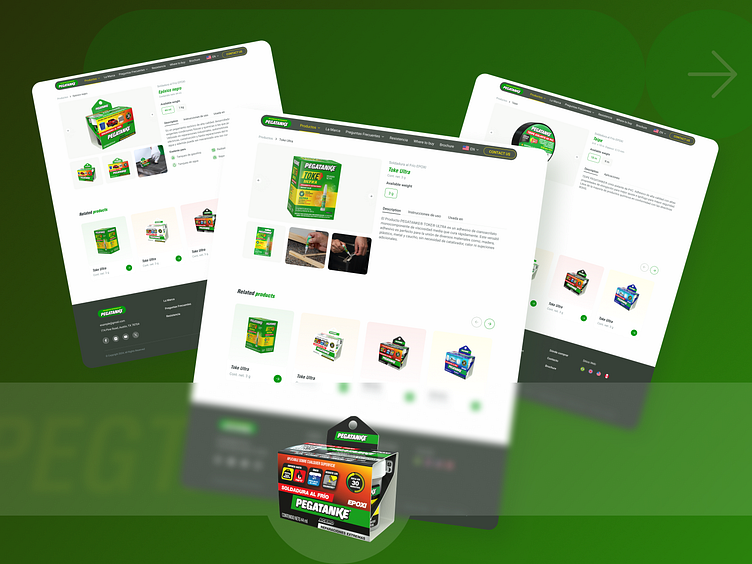
The user journey is streamlined through an intuitively structured top menu, making navigation seamless and user-friendly. This design choice ensures that whether someone is looking for product details, tutorials, or purchase options, everything is accessible with ease and efficiency. 🛒👌
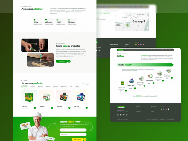
On the product pages, the thoughtful use of icons to highlight key features enhances understanding at a glance, aiding quick decision-making. Real-time satisfaction statistics are presented with eye-catching graphics, bolstering trust and underlining the product’s effectiveness with actual user feedback. 📊🌟
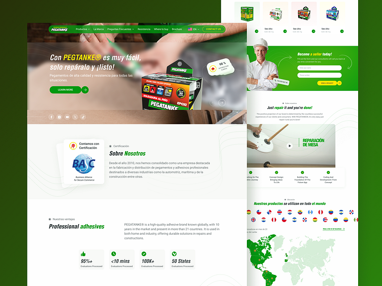
Furthermore, the website weaves a compelling narrative in the 'About Us' section, connecting visitors with the brand's journey and ethos. Testimonials and detailed case studies are strategically placed to build credibility and showcase customer satisfaction, fostering a connection that encourages engagement and brand loyalty. 😊📖
Elevate your brand with design that speaks volumes. Let's craft your digital success story together:
