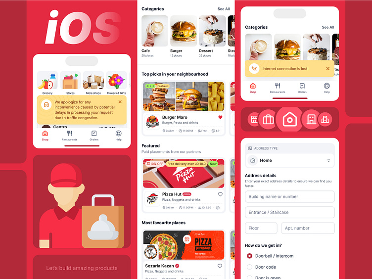
🍔 Food Delivery App - iOS
Excited to share a vibrant redesign of an iOS food delivery app.
This design focuses on delivering a smooth, efficient user experience while keeping things visually engaging and intuitive. Let’s dive into some key features and decisions made during the design process.
🔑 Key UI/UX Design Features
Unified Navigation: The bottom navigation bar is structured around core user actions: Shop, Restaurants, Orders, and Help. By keeping it simple and functional, users can easily toggle between sections without confusion.
Category Exploration: The app design emphasizes quick discovery with categories like Cafes, Burgers, and Desserts at the top, allowing users to navigate based on their cravings effortlessly.
User Feedback Integration: Important alerts, like Internet connection lost and Traffic delays, are prominently displayed but in a way that doesn’t interfere with the user flow. The subtle use of yellow in these notifications helps grab attention without overwhelming the design.
Personalized Experience: Top picks in your neighborhood" is designed to create a hyper-local experience. Users can easily view recommendations based on location, driving a more personalized interaction with the app.
Onboarding & Delivery Details: The app uses a step-by-step flow for entering delivery addresses and specific instructions, ensuring clarity at each stage for both users and delivery personnel. The use of visual icons next to the form fields helps guide users through input steps.
Let me know what you think of the overall flow and color choices! Would love to hear your feedback. ❤️

