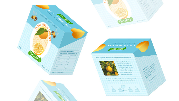
"Yuzu with Honey tea" Packaging Design
In this work I experimented with colours. My aim was to make the packaging unconventional and eye-catching. The packaging has a pattern of circles and hexagons that resemble yuzu and honeycomb.
For the design of the center section, I was inspired by the labels other products. The result is a big emblem with a honeycomb background and yuzu elements.
The letter O in the title has been replaced by a honeycomb brought by a bee.
Thank you!
More by Jeneta Jardon View profile
Like


