RICHII CHOUX | LOGO DESIGN & BRAND IDENTITY
Richii Choux fried chicken brand was born with the mission of bringing customers delicious, crispy chicken pieces, not only satisfying the taste buds but also creating product experiences full of joy and happiness.
The Richii Choux brand identity designed by Bee Art uses 2 main colors: orange and yellow. Orange represents enthusiasm, excitement and joy, and also represents youthfulness, dynamism and friendliness, helping Richii Choux become closer to customers. In addition, yellow is associated with optimism and happiness, which helps the brand become more trustworthy and connected to customers. The combination of these two colors helps create a cheerful, warm and energetic atmosphere - perfect for a fast food brand like Richii Choux, and at the same time in line with the brand's mission.
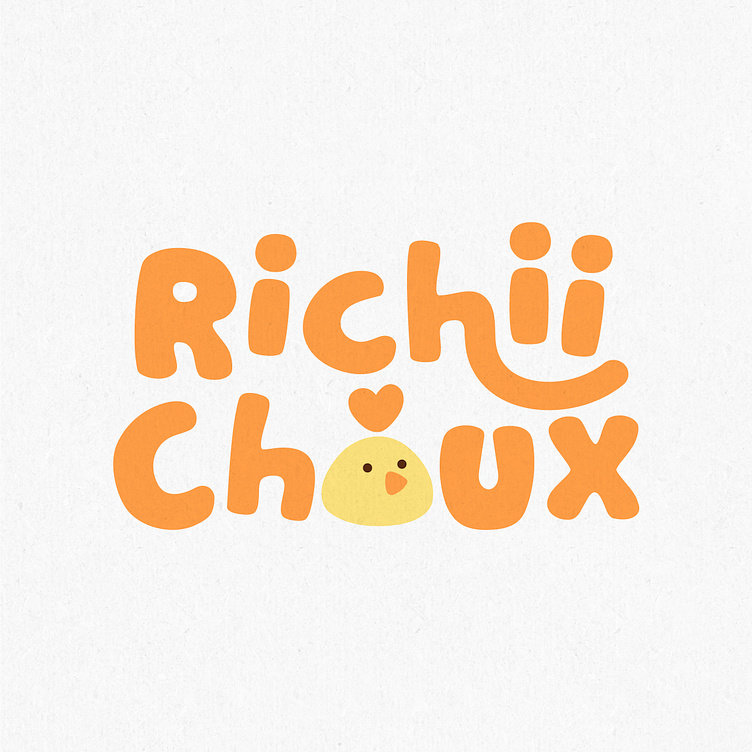
Richii Choux's logo is designed to stylize the brand name in a fun way, the letters are arranged in a messy way, without any rules, which helps the brand convey a message of fun and comfort. In addition, the letter O is also stylized to resemble a cute chicken symbol representing the brand's main product. The two letters I are drawn in the shape of a smiley face, adding fun and playfulness to the logo, which helps the brand easily attract its target customers.
-
Client Richii Choux
Logo Design Project. Logo is designed for Fried Chicken shop.
Copyright© Bee Art. All Right Reserved
Contact us:
• Hotline/ Zalo: (+84) 77 34567 18
• Email: info@beeart.vn
• Website: www.beeart.vn
• Facebook: https://www.facebook.com/BeeArt.vn


