32/32 – Albuquerque Atomics
Gone in a Cloud of Dust
Last but not least – the Albuquerque Atomics! This team is the final in the series, playing in the Canyon Division of the West Conference.
Infamous for consistent seasons of mediocrity, the Atomics surprised all and exploded on to the scene in Season 25. A magical run that included an All-Star campaign by a then 2nd-year starting quarterback, the Atomics clinched the division and secured a first round bye with an 11-5 record in West. Although it ended in a Division Round loss to Los Angeles, hopes were high in the Duke City. Since then, back-to-back losing seasons have all but distinguished the blaze but in Season 28, this team looks to reignite the spark.

Visual Direction
The team name "Atomics" wasn't adopted until last season for the youngest franchise in the league. Before then, this team was known as "the other Arizona team" – the Arizona Cobras. However, as the league matured and teams eventually settled in to their own identities, this franchise still hadn't found its own. In Season 27, the team opted for a fresh start in Albuquerque, a familiar UFL market (the El Paso Desperados spent a few seasons here as the New Mexico Desperados).
As for the nickname itself, "Atomics" originates from northern New Mexico's role as a research and development hub that was responsible for creating one of the first atomic bombs in the 1940s. In 1969, the National Museum of Nuclear Science and History was built to tell the story of researching peaceful uses of nuclear technology in today's age. The cultural phenomenon that came from this time period, known as the Atomic Age, has its visual footprint all over the identity of this team, with organic shapes and atom-like references throughout the design.
Execution
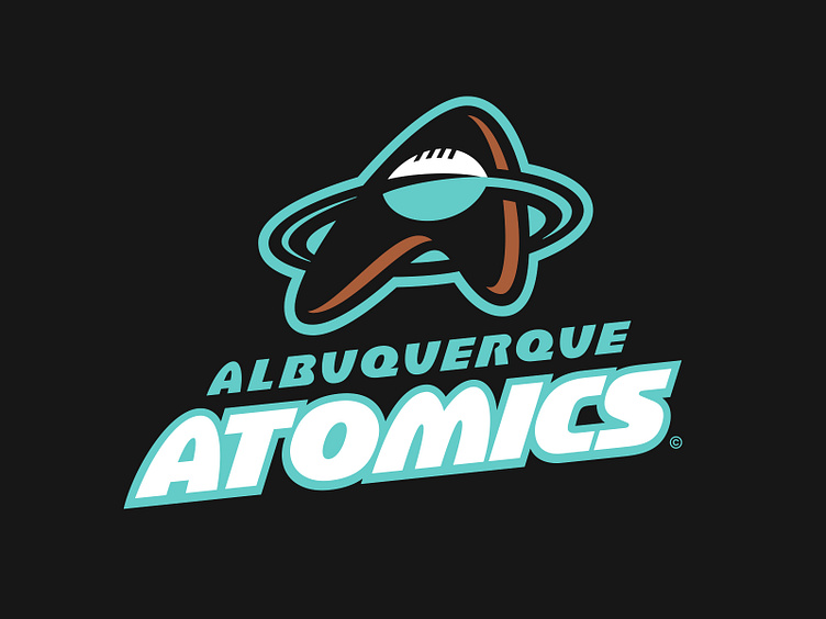
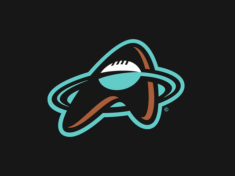
Albuquerque's primary logo is abstracted "A" with a copper drop shadow, representing both the city and team name. A radiant turquoise ring orbits the letter with football crossing the center and serving as the counter to the "A". The execution of the laces of the were inspired by the New Mexico state flag.
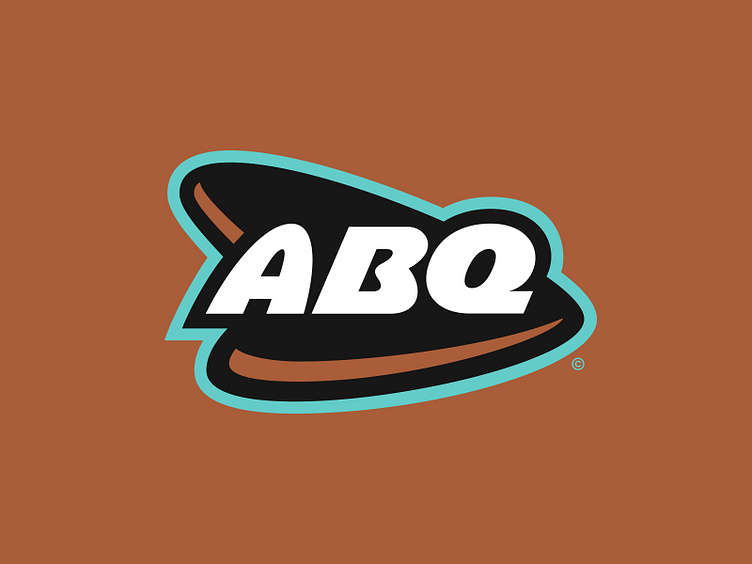
The secondary logo is a nod to the team's original logo, which featured "ABQ" across an oval badge. This time, the badge is replaced with an triangular container that mimics the same design language as the primary logo, which also features the copper drop shadow. A reflected version where the arrow points west is also present in the graphic suite.
The Atomics' identity also includes a one-color tertiary "A" mark, where the "A" is the same triangular shape with a football silhouette serving as the counter. This logo is mostly delegated to merchandise use.
With time period as rich with design as the Atomic Age, this franchise opts for two distinct typographic styles. The first style is heavily inspired by "space-themed" design, incorporating abstract letterforms with high contrast. Letters like the "A", "M", and "U" have pronounced arches while others like the "B" and "R" are a bit oblong and give off a sense of mystique. The second style borrows from mid-century modern but with unique subtleties. The crossbars of the "A", "B", "E", and "R" break vertical stems that give visual reference to the state flag. Additionally, the "O" and "Q" and perfectly circular, and atom-shaped call-back. Both styles are built in to "Albuquerque" and "Atomics" wordmarks.
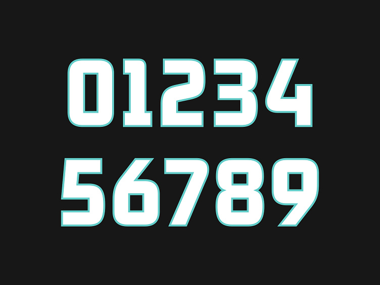
The jersey number set incorporates visual cues from both typographic styles, but in a much more reserved manner. Its drastically simplified and is much less heavy-handed, a better fit for the contours of the jersey space.
Feel the Power
As Albuquerque continues its new journey as the Atomics, it does so with a nuclear visual identity and vast graphic suite that will surely make an impact felt for years to come.
Football Helmet Mockup by SportsTemplates
____________________