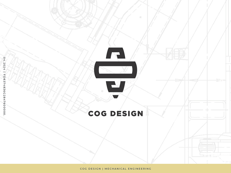
COG Design Logo
COG Design in Denver, Colorado reached out to me for a logo design! Joshua had worked with several brand designers and hadn't been able to pin down the right mark. The brief on this guy was to built an industrial brand mark that would feel competitive with larger firms since Joshua comes to the table with NASA-Level experience, but offers more of a boutique experience to his clientele.
"No gears, okay?"
Roger, Joshua! Let's not play it so close to the nose, right? So then what does COG stand for? Center of Gravity--a concept close to Joshua's mind as he was pushing his way out of big agency life into his own endeavors. Center of gravity is a concept that joshua deals with in his work regularly, and he really wanted a brand mark that would ecompass that in some way, that wasn't going to be a gear. Stop with all the gears, guys!! Let's find that nuanced approach :)
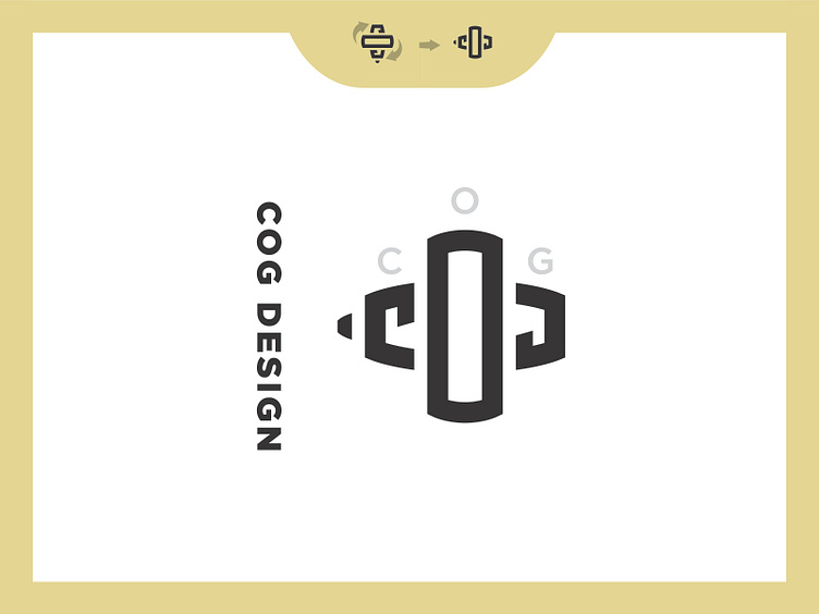
I built this mark after the idea of a top or a gyroscope. It also really echoes some nice mechanical shapes like a spark plug or a rivet. The mark was designed to covertly nest the letters, and no matter what way you turn it, you see the COG letters in the mark. A top, a monogram, a bold industrial brand mark that Joshua can feel good about laser cutting into parts, printing on schematics, business cards, or anything else.
I'm excited to hit the next phase on this brand project, and really dive into some exploration and nail down a brand guide that Joshua can pass to any creative he works with in the future.