potok.digital
Redesign of the Investment Platform
"Potok" is an investment platform that allows small and medium businesses to attract investments or take out loans. Both individuals and legal entities can become investors. According to the company's own data, more than 346 thousand companies have been evaluated, and there are currently over 135 thousand investors on the platform.
Potok.Digital is one of Evrone's long-standing clients, whom we initially assisted with development. Therefore, when the client needed help with a redesign, they turned to Evrone again.
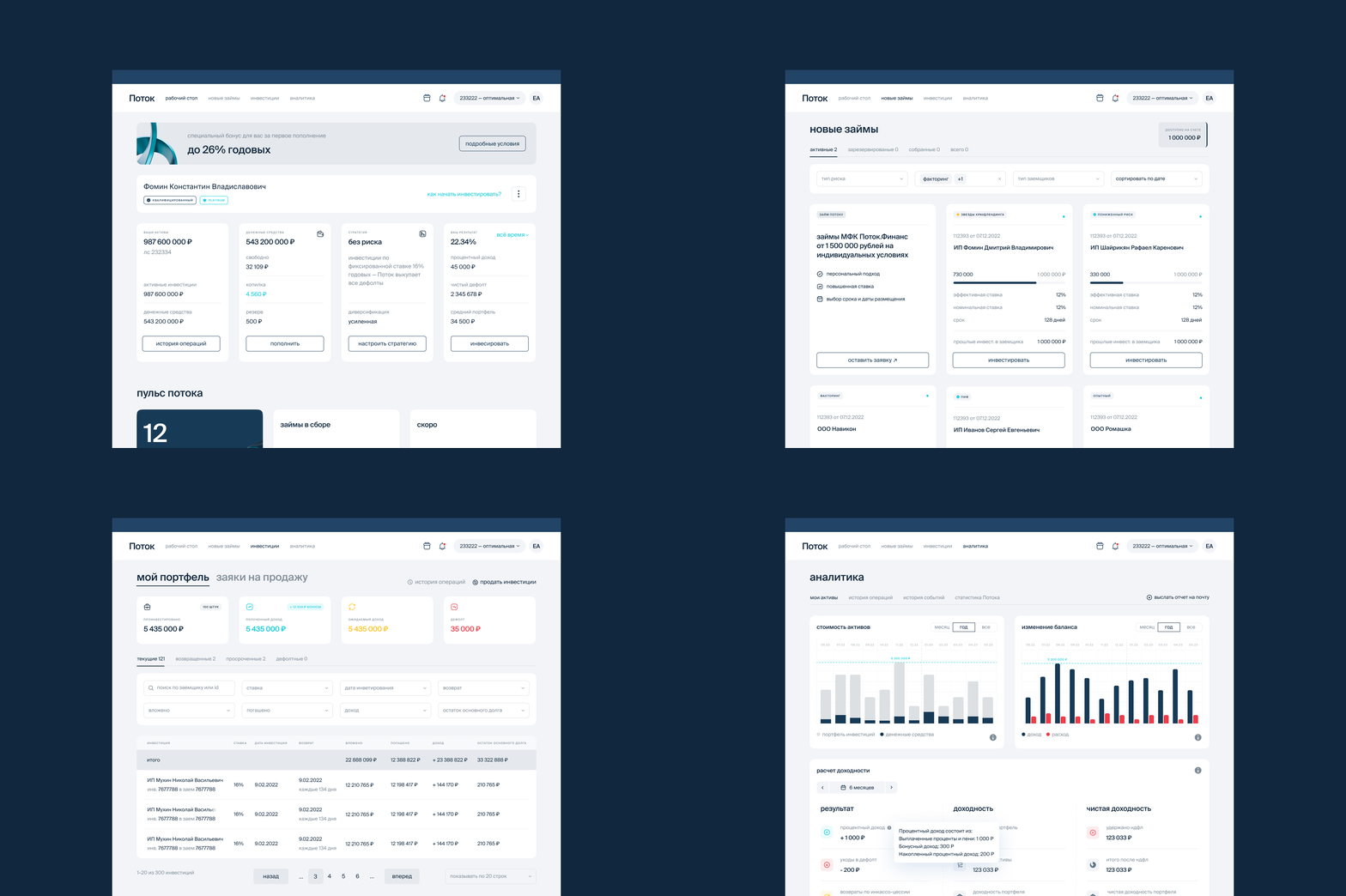
Investor Dashboard
Redesign Recently, Potok updated its corporate style, which was developed by Embacy. We assisted with its integration into the platform and the redesign of the user interface. The client wanted not only to change colours and fonts but also to make the user experience more convenient.
Changes started with the main page for investors. We proposed a block system to help structure the information on the page. Now, investors can immediately see the amount of available funds and how much money is in their account. Clear call-to-action buttons were introduced: buy, top-up.
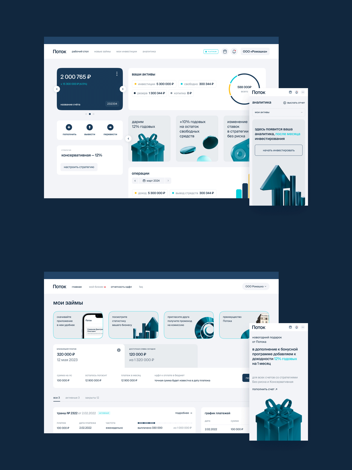
Borrower Dashboard Redesign
Simultaneously, we redesigned interfaces for borrowers. We had to come up with a new UX design for the fintech platform because initially this part did not even have a frontend; everything was rendered on the backend.
Loans and investments are two separate systems, but we decided to design them in a unified style. Firstly, because some clients may fall into both categories, and secondly, it is easier to maintain the design and integrate new features.
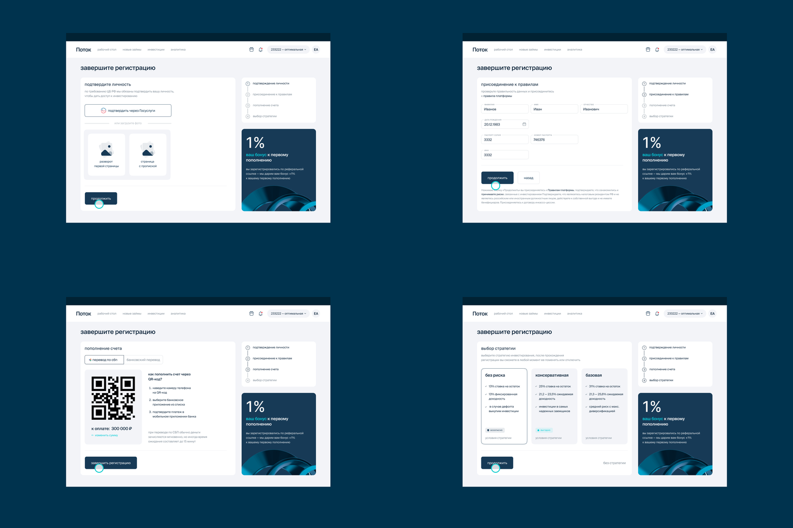
New Onboarding
As part of the redesign, we simplified the registration process for investors and borrowers. Investors go through three steps: uploading their passport, signing documents, and topping up their account. Borrowers start with uploading statements, fill out a form in groups, and use the borrower's calculator to view conditions.
Platform for Agents
A new feature in "Potok" is the platform for agents helping to arrange loans. The interface is based on the section for borrowers but uses tables for convenience. Agents can fill out a form and attach documents, while clients only need to sign. The signing link is easily accessible to each client.
Future Plans
Among the major updates are plans for new features for investors. It is planned to add stories and news, and in general, to create a more "bank-like" interface, where users can immediately see multiple accounts, switch between them easily, and assign them names. This will make it even easier for users to adapt to the platform.
UX/UI and product design
Jane Bessonova
Presentation
Denis Bezrukov & Jane Bessonova
Brand illustrations
Embassy & Jane Bessonova
—
Email: mail@evrone.com
Website: evrone.com


