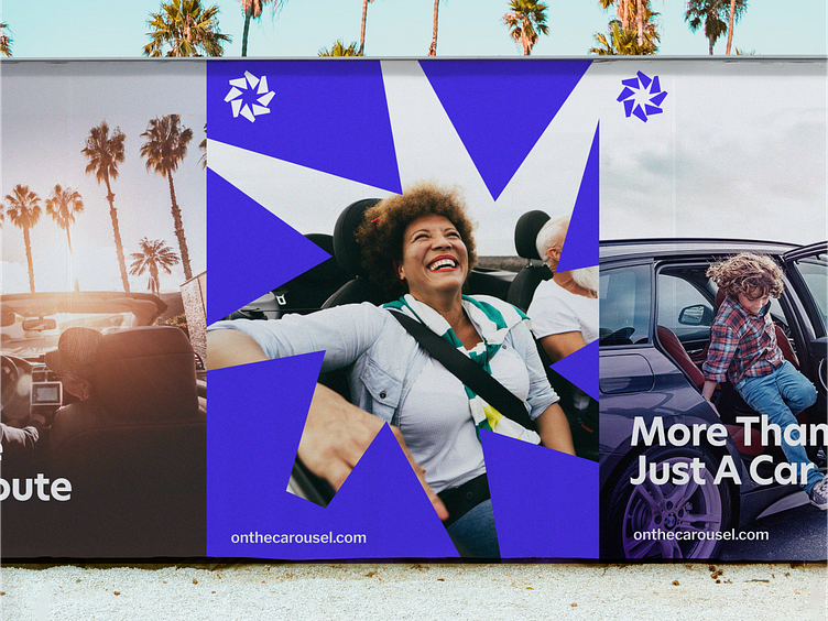
Carousel Posters
With the Carousel rebrand, I wanted a way to highlight people and put them at the forefront. The negative space of the logo mark provided an easy way to highlight individuals and created a sense of them radiating from the frame.
✌️Do you have a project in mind? We’d love to hear about it. Get in touch here!
More by Heyo View profile
Like
