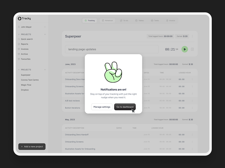
Pop-up illustrations for Tracky
When integrating brands into SaaS, it’s crucial to maintain consistency in foundational design elements, microcopy, and overall brand feel. Below are a few exercises I recently worked on to ensure Tracky's brand values are reflected throughout the product.
When working with brand colors, it’s important to consider the semantic meanings of each color. This ensures they don’t override the narrative but instead support the intended action whenever possible. This is one way to streamline the foundation and ensure consistency throughout the brand.
Feel free to join our journey! See you soon at Tracky.so <3
Thanks for watching!
More by It's Tilly View profile
Like


