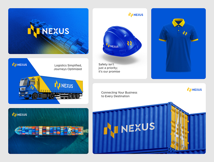
Nexus Logistics Logo Branding | Allyana Studio
Nexus Logistics
The concept was to create a strong, professional, and trustworthy visual identity for Nexus Logistics that reflects reliability and efficiency in logistics services. The use of bold colors like blue and yellow symbolizes trust, safety, and energy, which are crucial elements in the logistics industry. The integration of the 'N' symbol in the logo emphasizes connectivity and movement, aligning with the idea of linking various destinations seamlessly.
Allyana Studio
Show some love ❤️ and let us know what you think! Are you impressed?
Let's connect and create something extraordinary together! ✨
👇 Click below to get in touch 👇
More by Allyana Studio View profile
Like

