Effective UIs for Vital Signs and Measurements
What defines ease of use in a UI for vital signs and measurements?
For starters, it should feature clear visualizations, ease of data entry, and timely alerts for abnormal readings of signs like temperature, blood sugar level, heart rate, or blood pressure.
Pre-defined formats ensures consistent and accurate recording of vital signs. Visualization tools like graphs and charts help identify trends and potential issues. Customizable alerts for abnormal readings allow for timely interventions.
Here are a few examples -
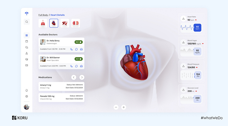
1. Vitals captured via a wearable device
This health app captures vitals via a wearable. Users can click on the respective organs to access its vitals. The measurement units are clearly depicted on the right side, highlighting alarming levels, if any. Based on that, the app also recommends doctors and provides information about existing medication entered by the user.
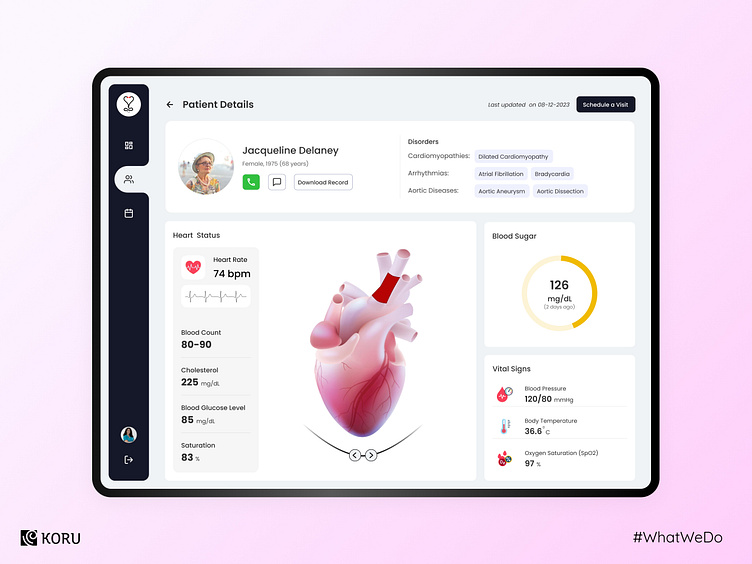
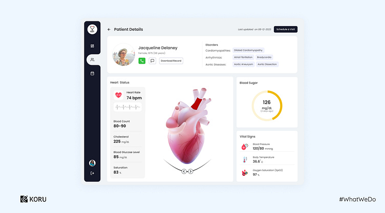
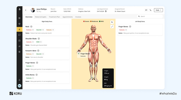
2. Displaying an overview of the patient’s details and vitals
This UI provides an at-a-glance overview of all the necessary information. The patient’s contact details and disorders are listed on the panel on top. All vital signs for the selected body part are listed on the left panel, with other important and relevant vitals listed on the right.
3. Chart view depiction of vitals
This is a novel way to present vitals which uses the body chart to mark afflicted areas. The severity of the afflicted areas is categorized by color, depicting mild, moderate, or severe pain.
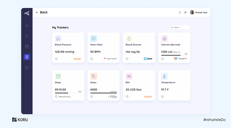
4. Cards depicting vital signs
All vitals are listed on cards here, with the source of the data (Apple Health, Google Fit, iHealth, etc.) mentioned. The time of the latest recording of vitals can be accessed by hovering over the card.
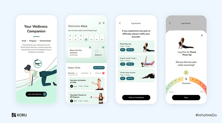
5. Depicting levels in vitals
Visualization tools like graphs and charts help identify trends and potential issues, which is a crucial aspect of designing vitals. This pain scale, for example, is designed to keep records of the pain levels felt by the user during movements/exercises. There is also the option to record the difficulty level experienced during certain exercises.