PDP Redesign Comparison ✦ DFTBA
For the Product Detail Page (PDP) in our DFTBA redesign project, we focused on enhancing the user experience and creating a more modern and intuitive interface.
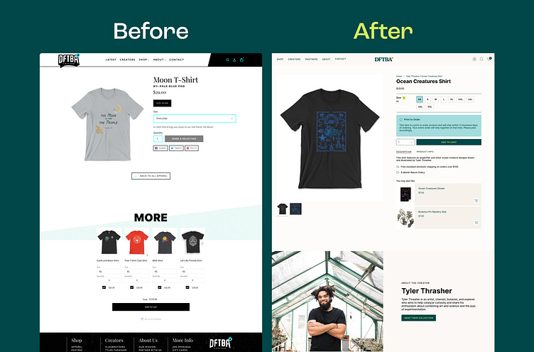
Before: The original design had a straightforward layout but lacked visual hierarchy, making it difficult for users to focus on key information. The product details were cluttered, and the call-to-action elements did not stand out enough. The design also had minimal emphasis on storytelling or creating a connection between the product and the creator.
After: We redesigned the PDP to prioritize clarity and ease of use. We improved the product imagery, making it larger and more prominent, to give customers a clearer view of the details. The layout now includes a more structured size selection interface and an enhanced call-to-action button, making it easier for users to add products to their cart. We've also integrated a storytelling aspect by including a dedicated section that highlights the creator's story, adding a personal touch that connects the product to its inspiration. The 'You may also like' section was streamlined to showcase relevant products in a more visually appealing way, encouraging further browsing.
The result is a more cohesive and engaging shopping experience that aligns with modern e-commerce trends, guiding customers seamlessly from product discovery to purchase.
About Prismfly
Driving revenue for eCommerce brands through conversion rate optimization, full-stack development, branding, UI/UX design, and lifecycle marketing services.
learn more at www.prismfly.com
or reach us directly at contact@prismfly.com
