Healthy Line. Packaging Design. Brand Identity. Brand Book
Healthy Line is a health-focused brand offering bakery mixes and breads made from natural ingredients with minimal or no yeast. The brand emphasizes wellness, sustainability, and balanced living.
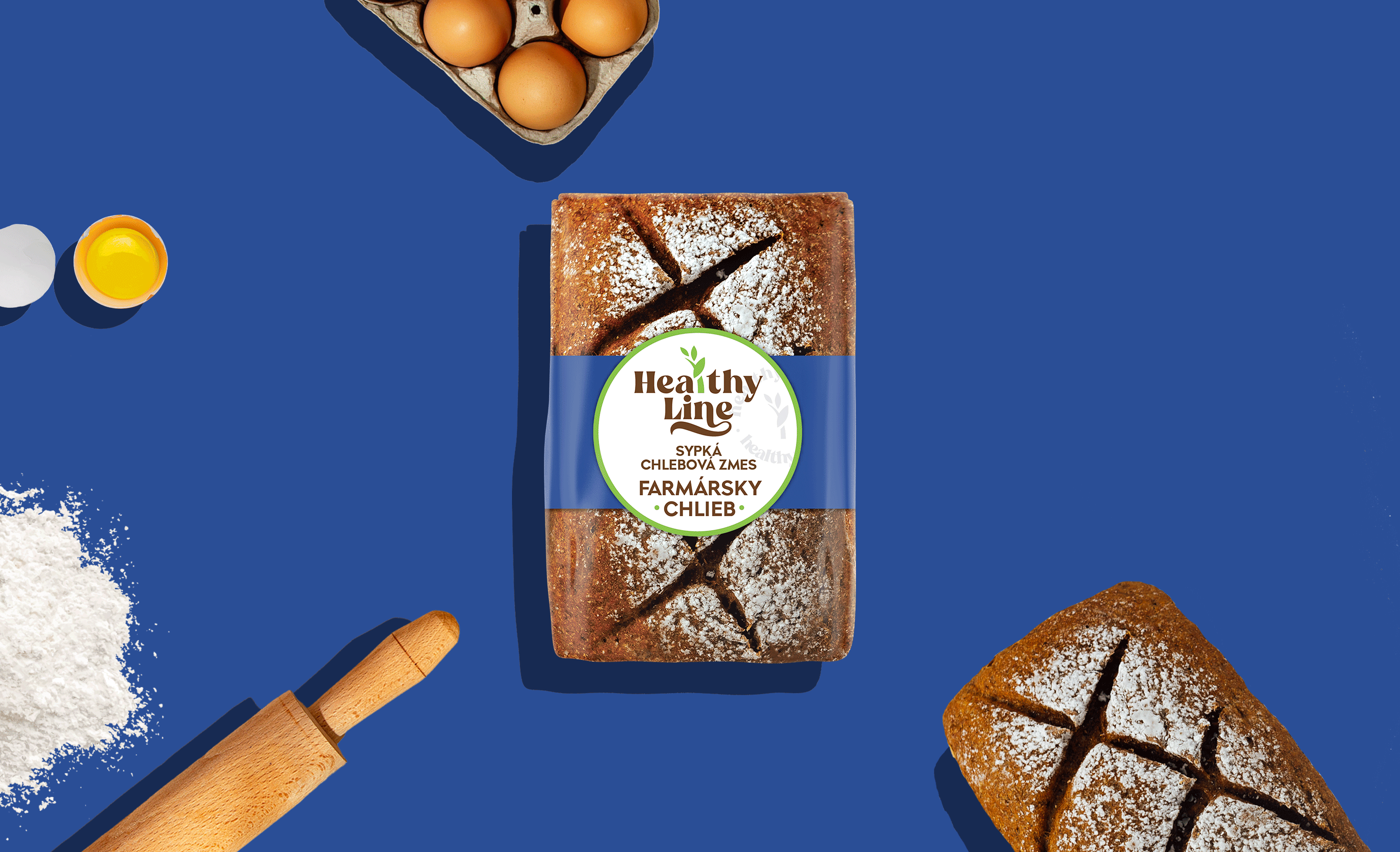
The logo design reflects the natural essence of the products with rounded shapes, soft earthy colors like green and white, and a plant sprout symbolizing growth and health.
The packaging design is minimalistic and color-coded to differentiate between bread varieties, with realistic bread textures highlighting the artisanal quality of the products.
A comprehensive Brand Book was developed to ensure consistent application of the brand identity across all media. This includes detailed guidelines for logo usage, color palette, typography, visual elements, and tone of voice. This approach reinforces Healthy Line’s position as a trusted leader in the health food market.
Get to know more about the project:
https://sotdesign.com/en/works/work/healthy-line.-flour-and-baking-mix-packaging-design
Ready to team up? Connect with us at hello@sotdesign.com
