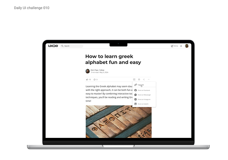
Daily UI challenge 010-Social share
Hey everyone! :)
Today’s challenge was 'social share,' and I’ll admit, I wasn’t entirely sure what to focus on at first. Was it about designing the share icon itself, or should I create an entire screen where users can share articles, videos, or images? I found myself a little unsure about the direction to take.
Since I couldn't ask for more clarification, I decided to see how other designers approached the challenge—surely, we couldn’t all be off track! It turns out, many of them interpreted it similarly, focusing on designing social share features for blogs, social media platforms, or even music player apps.
I kept a few key goals in mind throughout the process: making sure the design was clean and readable, ensuring that users could easily share the article, and keeping navigation intuitive without taking away from the main focus—the content itself. After all, the goal is to let users share what they love while still being able to fully engage with the article they came to read!
With that in mind, I drew inspiration from Medium's layout, where the single-column layout keeps users focused on the article. The likes, comments, and social share features are conveniently placed, easily accessible without distracting users from their main goal—reading the content.
Let me know what you think of today's challenge!


