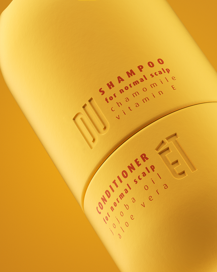
Branding & packaging design for DUET hair care line
DUET is an innovative line of hair care products presented in 3 series: for normal, dry and oily head skin types. We created an unusual package shape that would convey the brand's innovative approach and be suitable for active people. The main idea: everything you need in one bottle.
The elongated letters of the logo echo the elongated shape of the bottle, and the letter E represents a two-section bottle with an open cap.
Contact us to create the packaging design for your brand:
More by PacPac Studio View profile
Like

