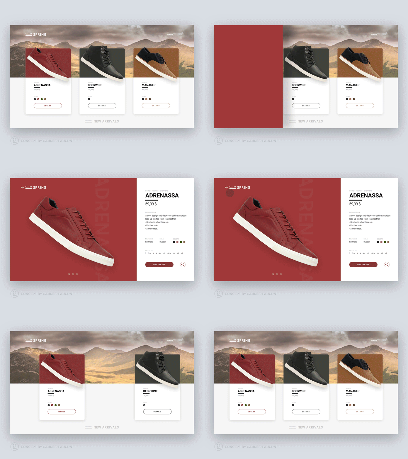
Shoe / sneaker shopping — design & animation concept
What started out as: "oh, I have this neat idea for a product card, let's see how it would actually look..." quickly became a full showcase interface. The main idea was to explore how to give big and bold focus on products when shopping online. I tend to think that most shops don't give enough visual importance to their products —that's a very personal opinion— I wanted to explore using a card design that appeared to be a perfect fit for this type of approach. One thing lead to another and this interface came along quite nicely, ended up making a product details page as well. Then came the final touch, the addition of a few animated transitions —see gif here under— to really explore the potential of the layout.. The layout and animations could —with very little tweaking— work not only for shoes but for many types of products, perhaps i'll explore alternatives if time allows it. Hope you'll like the approach
You can also see an HD version (12.5Mb) of the animation here: http://gabrielfaucon.com/work/cis.html
or on Behance https://www.behance.net/gallery/33500435/Shoe-sneaker-shopping-design-animation-concept?

