GUCHA | LOGO DESIGN & BRAND IDENTITY
Gucha coffee brand was born with the mission of bringing customers relaxation and enjoyment through each product. With the perfect combination of brewing art and enjoyment space, Gucha creates an elegant experience, blending delicate flavors and emotional connection with nature.
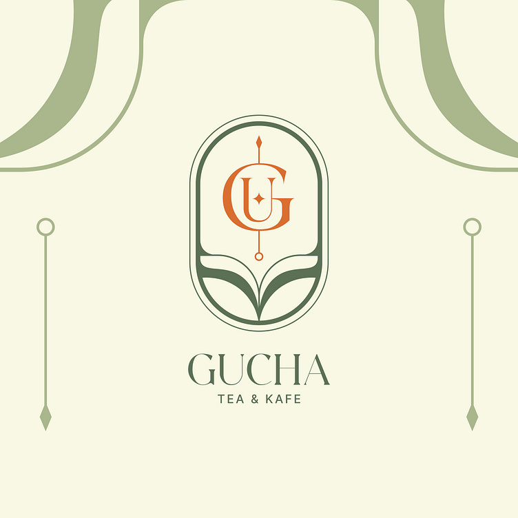
The Gucha coffee brand identity designed by Bee Art uses 2 main colors: green and orange, each color carries its own message. Green represents freshness and peace, reflecting Gucha's mission as a brand that wants to bring relaxation and enjoyment to customers. Meanwhile, orange represents creativity, energy and the warm feeling that the brand wants to convey to customers. The combination of these two colors creates a balance between gentleness and dynamism, between classic and modern.
The brand's logo is designed to harmoniously combine the letters G and U, the first two letters of the brand name, with delicate lines evoking the image of tea leaves. The letter GU is designed to stand out, combined with a small 4-pointed star in the middle, representing quality, prestige and leadership. The arrow is designed to point upwards, symbolizing the brand's continuous development and progress. All elements are neatly arranged in an oval shape, implying protection, stability and sustainability, demonstrating the brand's commitment to providing customers with memorable experiences.


