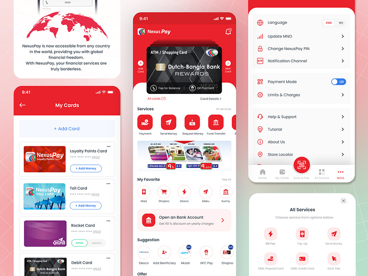
NexusPay Redesign
Hello Creative People 👋,
Introducing the NexusPay Redesign at Kona Software Lab, a sleek and modern approach to evolving user experiences in fintech. This redesign enhances the payment experience, grabbing attention from potential users and investors alike.
During the redesign process, we focused on:
User Research: Conducted in-depth interviews and surveys with our 4.4 million users to understand their pain points and preferences.
Wireframing & Prototyping: Created low and high-fidelity wireframes to visualize user flows and test functionalities.
Collaborative Design: Worked closely with product managers, developers, and stakeholders to ensure alignment with business goals.
Usability Testing: Gathered real-time feedback from users to refine the interface and improve navigation.
Iteration: Fine-tuned the design based on user feedback, improving performance and ease of use.
Press "L" if you love it!
More by Abir Hasan | Product Designer | View profile
Like

