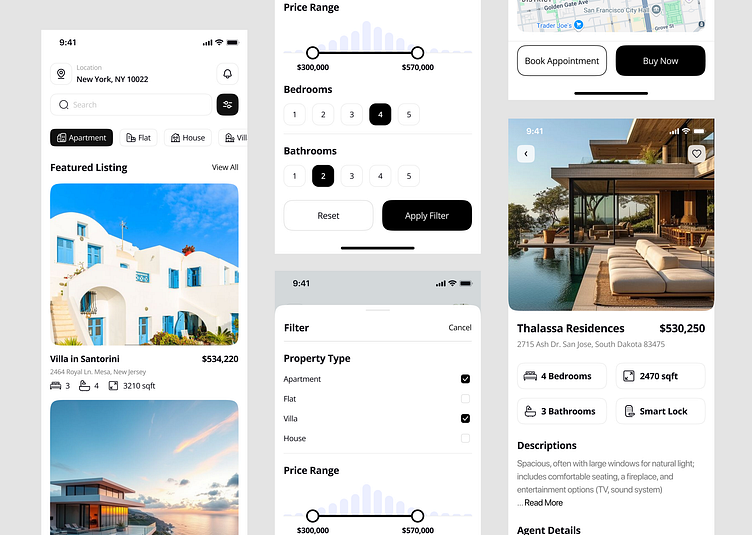
Real Estate Mobile App Design
Hi Folks!
Here's my new exploration of the Real Estate Mobile App. You can Buy or Rent a House with one app. I try to make it clean with a combination of Black and Small Fresh color.
Scroll Down for more detail!
When designing your real estate app, focusing on specific aspects can significantly enhance user experience and functionality. Here are some key areas to consider:
1. User-Centric Design
Intuitive Navigation: Ensure users can easily browse listings, filter searches, and access features.
Accessibility: Design for all users, including those with disabilities, by using readable fonts, color contrasts, and voice commands.
2. Visual Appeal
High-Quality Imagery: Use vibrant, professional images for listings to attract users and convey property details effectively.
Consistent Branding: Incorporate a cohesive color scheme and typography that aligns with your brand identity.
3. Functionality
Search and Filter Options: Allow users to filter properties by location, price range, number of bedrooms, and other criteria.
Map Integration: Provide a map view for users to explore properties geographically, enhancing their search experience.
Map & Filter UI
Let's talk about your project
I am available for new projects 🔥
📩 Email: info.madhu786@gmail.com
WhatsApp: https://wa.me/+8801867204649
Telegram No: https://t.me/Madhu_Tazrin
Skype: https://join.skype.com/invite/YrcTWEAt0rE6
Follow me:


