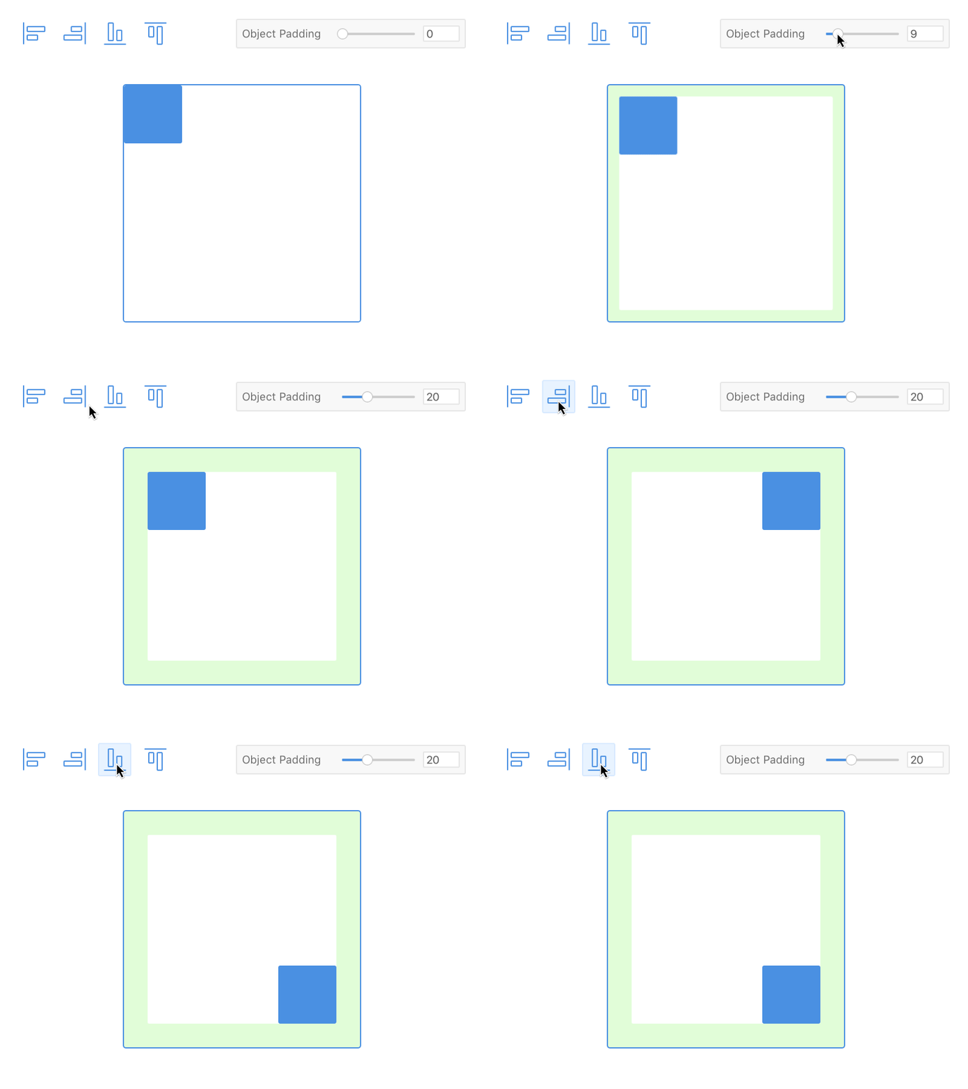
Padding Concept
In designing for the web, it's always nice when your tool/s of choice reflect the behavior of the medium for which you are designing. Often times it can be frustrating when accomplishing simple tasks isn't so...well, simple.
I regularly find myself wishing that certain simple CSS behavior was more closely mimicked in modern design software.
This concept came out of my desire for the ability to assign CSS-like padding properties to objects in a design application (sketch/photoshop) without having to set up guides, abuse grids, constantly align things, or always having to make fine-tuned adjustments (repeatedly nudging things all over the place); The ability to have an object be aligned left, right, top, or bottom, while still being conscious of another object's padding.
A guy can dream.
