Belgrade's Main Bus Station's Landing page UX/UI Redesign
Introduction
A new station was recently established in New Belgrade to help reduce traffic congestion in the city center. This move was accompanied by the launch of an online platform, allowing users to purchase tickets, check bus arrivals, and access other services.
Unfortunately, this application does not meet the high user experience standards, given the importance the bus station holds for the citizens of Belgrade. My task in this case study is to identify and correct all relevant issues to ensure a flawless user experience.
Navigation (Before Redesign)
The website’s navigation is not effective because it is poorly organized, leaving plenty of room for improvement through a better-quality site map. Below, I will list the issues with the current navigation.
Inappropriate “Bus tickets” tab: leads to an irrelevant page that only displays a form for entering travel destinations (page is shown below). The homepage tab shouldn’t exist, and “bus tickets” should become “buy tickets” since the website is all about bus rides and users already know they are buying a bus card. This date slider shouldn’t exist on this page, it is a mistake.
Arrivals: This is a useful part of this website, and I wouldn’t change anything about it. Although they will be used less frequently than ticket purchases, they deserve a permanent place in the navigation.
Services: Currently, under this tab, we can find the “Call Center”, which doesn’t make sense because the call center is not a service provided by the Belgrade bus station, so this tab will be reallocated. Other services listed are luggage storage, bus parking, and tourist bus departures.
I think it’s okay to list them, but in a more modern way through a dropdown menu that will also include the most important information related to these services under their titles
saving time and effort for some users.
Other: Other information has taken up quite a bit of space without being particularly important. My idea is to place it under the tab “Additional Info”. Language will be available. The cart will be removed since it will be on the side when the user is buying a ticket.
Navigation (After Redesign)
Considering all the facts, I have created a new site map. It will enable users to more easily access the information they need. There is a “New location” page in the dropdown of Additional info, highlighting the importance of their new location in Belgrade.
Landing page (Before redesign)
There are several issues with the current design of this website, which I will outline below:
Vibrant Sponsor Banner — The most striking element on the landing page is the sponsor banner with vibrant colors. This distracts users from more important information and features of the site, which is undesirable since the banner is not a key element of the page.
Premature Warning “All fields are required” — Users are immediately warned that “all fields are required” even though they have not entered anything yet. This can cause frustration and a feeling of guilt as if they have done something wrong when they have just arrived on the site. Also, the button is disabled, which may lead users to think that they cannot search for rides.
Redundant Arrivals Banner — There is a banner for arrivals, which is already listed in the navigation. There is no reason for it to be there, causing redundancy and taking up space.
New location — Given that the station has been relocated to New Belgrade, it is crucial to communicate this to users. The current version of the website has a map showing the new location at the hardly visible bottom of the screen.
Landing page (After redesign)
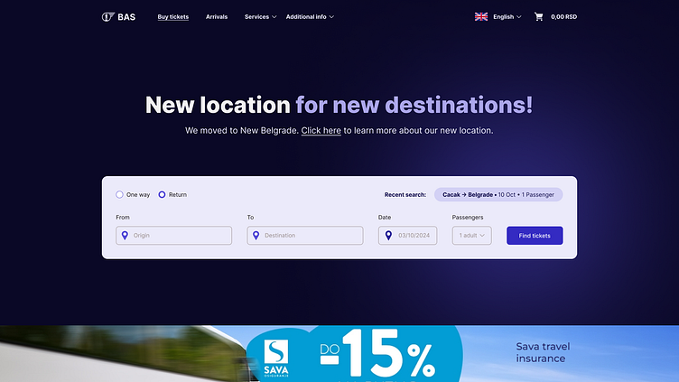
What used to be the landing page or homepage no longer exists, because there is only a “Buy Tickets” tab now, and its main purpose is to enable users to obtain the tickets they want easily.
The banner has been retained at the bottom of the screen due to the business side of this project.
I assume that its significant position on the screen is part of a business agreement, so it has been kept, but it is not in the foreground, thus it does not distract the user. Instead, it is positioned where it can easily cause banner blindness, making it an insignificant part of the visual hierarchy.
An option to add passengers has been introduced, allowing the user to specify the number of adults, children, or students for whom the ticket search is being conducted (there is a different ticket price for each group). All values will initially be set to 0.
An option to display the last search made by the user, with the data they entered in the fields, has been introduced. This is done using cookies, and it is explicitly necessary to inform the user to agree to this policy beforehand.
A much clearer option for selecting either a one-way or return-trip journey has been introduced in the form of radio buttons, as opposed to the previous solution, which was implemented as a rectangular switch that did not resemble one.
Thanks
Thank you for reading this brief case study. Would you like to see the redesign of the entire website for Belgrade’s main bus station?


