WoodKing | Visual identity
Woodking | Scierie
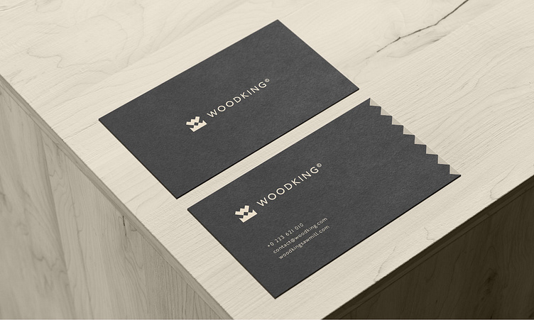
Woodking is a high-end sawmill specializing in wood processing recognized for its know-how, which offers finely worked woods to architects, decorators, designers and luxury construction specialists. The objective of the project was to create a visual identity that reflects the high-end qualities of the brand while integrating the rigorous aspect of the wood industry.
The brief:
Create a visual identity that reflects the high-end qualities of the brand while integrating the rigorous aspect of the wood industry.
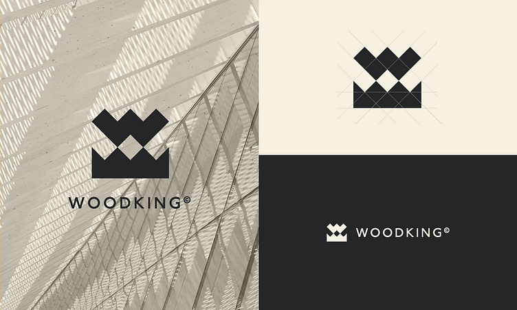
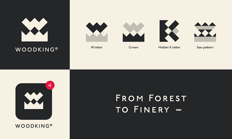
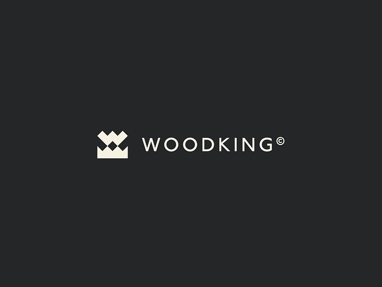
A logo combining the letter "w" of Wood, the crown of King, a more discreet letter K and one of the basic tools of the trade: the saw. The whole is marked by sharp shapes that represent the demands of woodworking.
As for the colors, they recall the elegance of the high-end with charcoal black while recalling the sawmill sector with an off-white of light wood.
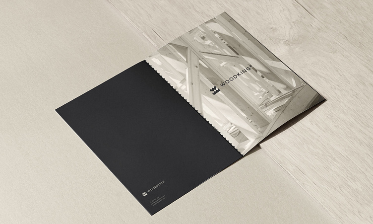
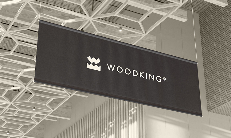
The entire visual identity is declined to adapt to both printed media and the web, in large or square formats, in black or white and a crown was added to the WoodKing slogan to support their identity; "From finest to finery".