Redesigning Digikala's USP Icons
Redesigning Digikala's USP Icons
Hey Dribbblers 👋
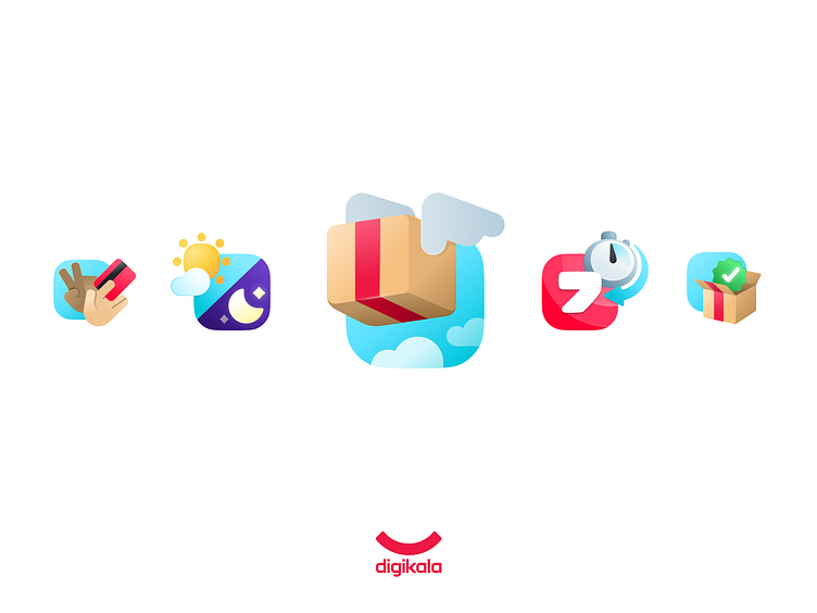
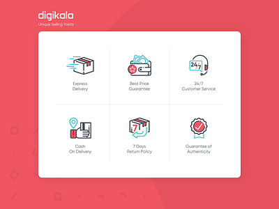
I was casually browsing through Digikala's website when I stumbled upon the footer section and noticed their USP icons. It got me thinking, "These could use some improvement!" So I randomly sketched a few concepts, and to my surprise, I really liked how they turned out. Naturally, I had to bring them to life. Just like that! The original design, created by Mr. Mohammad Ghaderi, is also included here with respect.
What do you think? Do you feel the current icons need improvement? How close do you think my proposal aligns with Digikala's visual identity? Would love to hear your thoughts!
Thanks for checking out my latest design! If you're interested in a custom piece, I'd love to hear from you. DM or email me. And of course, don't forget to follow me on Instagram & LinkedIn for more creative stuff.


