The GreenTech Journey
Chapter 1
The Call for Transformation
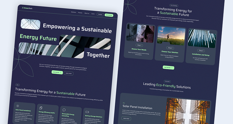
It all began with a message from John, GreenTech’s representative. The company, specializing in renewable energy solutions, had outgrown its old website. John’s words were clear: "We need a site that reflects who we are—pioneers of the future. Not another typical solar panel page."
GreenTech wanted a bold, modern site that showcased their vision of a sustainable tomorrow. Their old website wasn’t doing that. It was time for a change, and I was excited to help bring that vision to life.
Chapter 2
Dreaming Beyond Solar Panels
During our discussions, GreenTech emphasized one key thing: they didn’t want the usual imagery of solar farms and wind turbines. They wanted something that represented the future of renewable energy.
Inspired by this, I proposed a futuristic, abstract visual approach. The website would use dynamic images of light, energy, and motion—symbols of innovation and progress. It was about capturing the feeling of energy and the potential for a sustainable world, rather than simply showing the technology behind it.
Chapter 3
From Wireframes to Reality
To turn this vision into reality, I started by crafting detailed wireframes, ensuring the user experience would be seamless. Once the wireframes were approved, I moved on to designing the final layout in Figma. We focused on a clean, intuitive design that guided users naturally through the content. The palette—greens and blues—evoked sustainability and trust.
With the design approved, the next step was development. GreenTech decided to use Framer for the website build, so I transitioned from design to development. Framer allowed for the creation of smooth, responsive pages with animated segments that brought the content to life, making the site feel dynamic and engaging.
Chapter 4
A New Beginning
When the new GreenTech website launched, the impact was immediate. Within weeks, user engagement soared by 30%, and lead generation increased by 20%. The abstract, future-focused imagery set them apart, and the site’s performance brought in more traffic and conversions than ever before.


