Rewards Page CTA Test ✦ Princess Polly
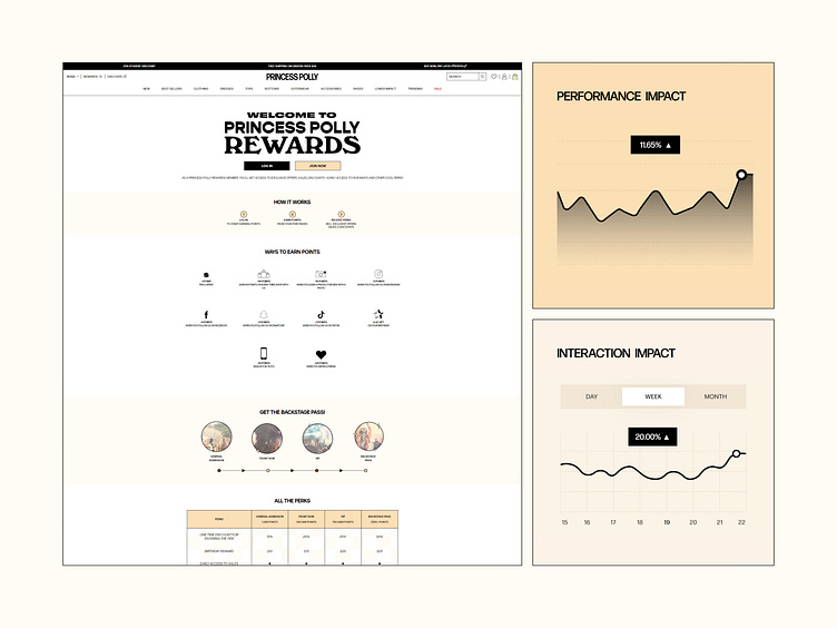
Our goal for this test was to improve the account/profile creation flow by making the call-to-action (CTA) buttons more distinct for new users versus returning users. The hypothesis was that clearer differentiation between these two actions would drive higher engagement, especially for new users.
We tested three variations:
v0: Original design (no changes)
v1: Use an underline version for one of the CTAs
v2: Changed the "Join Now" button to a more noticeable color
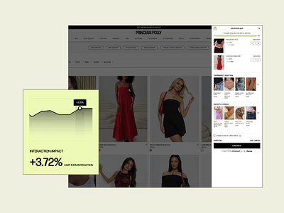
The winning variant, v2, showed a significant improvement in user engagement for new accounts in the US, as highlighted in the performance metrics. This small visual change led to a +11.65% performance increase and a 20% rise in interaction, proving that simple design tweaks can make a big difference.
About Prismfly
Driving revenue for eCommerce brands through conversion rate optimization, full-stack development, branding, UI/UX design, and lifecycle marketing services.
learn more at www.prismfly.com
or reach us directly at contact@prismfly.com

