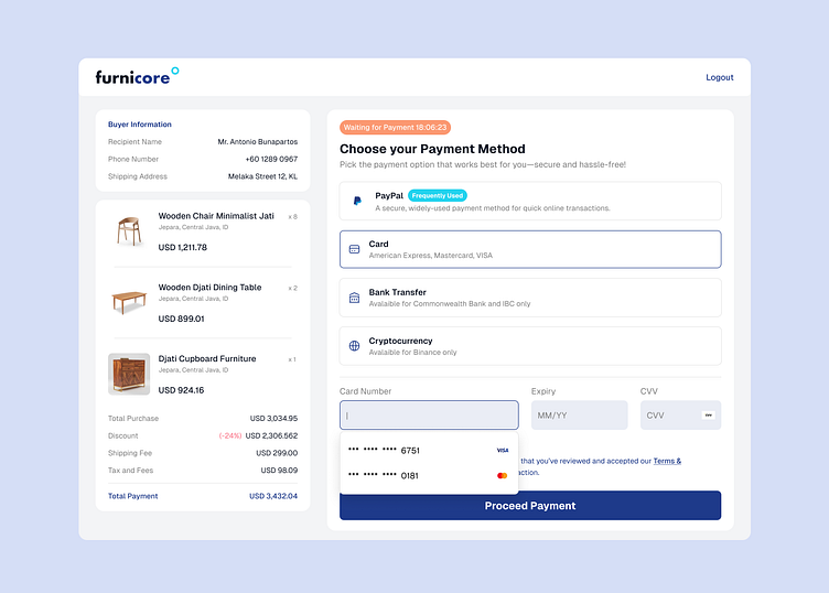
Furnicore Payment Method - Day 2/7 UI Challenges
Choosing Payment Method
Hi Dribbblers 🏀
Day 2 UI Challenge is creating a secure and intuitive area within a website or app where users select their preferred method for transactions.
For today's challenge, I want to use Website as artboard for myself to craft. So, my take is creating seamless and clear user interface when user has to choose their payment method. I have 2 alternatives. The first one is having white background, and the other one is not. The goal is to give more clarity on Payment Method section.
I'd love to hear your thoughts on this one! Any feedback or suggestions on how to improve would be greatly appreciated.
Here's my take on Day 2 Challenge—feedback welcome!
So, what do you think? 😉
Hit me up at maulidaah@gmail.com 📪
More by Putri Maulidah View profile
Like

