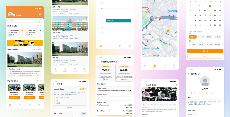
Class and Enrollment Apps
Overview
Designed specifically for Korean students attending after-school programs, also known as hagwons. These academies are integral to students’ academic progress in Korea, often supplementing their formal education.
The app aims to streamline administrative processes by transitioning from paper-based methods to digital systems.
My Design Process
1. Research (user interviews, surveys, analytics)
2. Wireframing (low-fidelity sketches)
3. Prototyping (interactive, clickable models)
4. Visual Design (color scheme, typography, imagery)
5. High-Fidelity Design (detailed, visually appealing designs)
6. Usability Testing (validate design decisions)
7. Design Handoff (to developers)
8. Testing and Launch
Key Tools: 1. Figma
Problem Statement
Challenges: Currently, after-school programs rely heavily on paper-based records for tasks like attendance, grade tracking, lesson planning, and student management. This not only creates inefficiencies but also makes it difficult for teachers to access and organize information quickly. Students also face challenges when enrolling in classes, as they need to visit academies or call to complete the process.
Project Goals: Minimize the use of paper by digitizing records for attendance, grades, lesson details, and student management. Provide an easy-to-use platform for students to enroll in available classes offered by specific academies. Ensure the system is convenient and efficient for both teachers and students.
Branding
Wireframe
1. Dashboard: Intuitive layout, calendar, popular academies/classes, clear navigation.
2. Search Academy: Quick search, filters, predictive functionality.
3. Academy Details: Overview, reviews, staff, classes.
4. Class Details: Cost, schedule, enrollment, course content.
5. Payment Plan: Clear options, transparent information.
6. Class Overview (Post-Enrollment): Lesson content, assignments, community board.
7. Lesson Details: Focused view, content, materials, assignments.
Key Design Principles:
- Intuitive navigation
- Clear layout
- Easy scanning
- Minimal distractions
- Seamless integrations
Mockups
It was a rewarding and challenging experience building an LMS app for the first time. I made sure to apply a wide range of UX methods to ensure the design met user needs while maintaining simplicity and functionality. From user research and wireframing to prototyping and testing, I focused on creating a seamless experience for both students and administrators. Each phase of the project presented unique challenges, but through continuous iteration and collaboration with developers, I was able to deliver a product that enhances the learning process. This project not only strengthened my UX design skills but also reinforced the importance of user-centered design in delivering a successful app.


