QuantaEdge Pricing Plans: Simplified for Every User
Introducing QuantaEdge Pricing Plans: Simplified for Every User!
I’m excited to present my latest design project—a comprehensive and visually appealing pricing plans page for Quanta Edge. In today’s competitive landscape, making pricing information clear and accessible is crucial, and I aimed to create a layout that does just that.
Design Philosophy:
The goal was to simplify the decision-making process for potential users. I focused on a clean and intuitive interface that allows visitors to easily compare different plans without feeling overwhelmed. By using a structured layout, users can quickly identify the features that matter most to them.
Key Features:
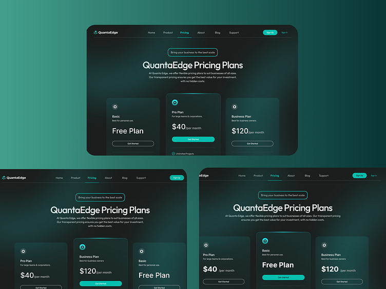
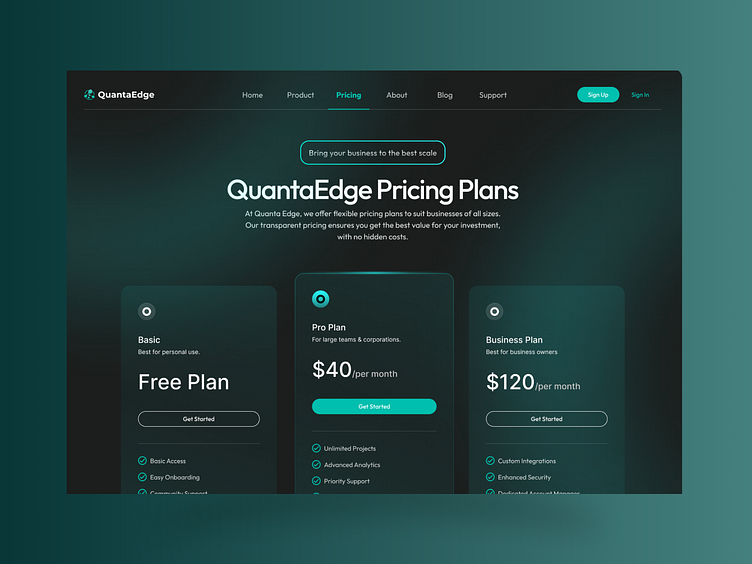
Clear Structure: Each pricing tier is clearly delineated, showcasing essential details at a glance. This design reduces cognitive load, allowing users to focus on what they need.
Visual Appeal: Engaging graphics and a harmonious color scheme enhance the overall experience. I utilized clean typography to ensure readability and create a polished look.
Call-to-Action Focus: Prominent buttons and actionable links guide users toward making informed decisions. I emphasized the most popular plans to help users navigate easily.
User-Centric Approach:
In designing this page, I kept user experience at the forefront. By incorporating feedback from potential users, I aimed to address common pain points encountered when evaluating pricing options. This design not only looks great but also serves its purpose effectively.
I’m eager to hear your thoughts on this project! What do you think about the layout and overall design? Let’s connect and discuss!