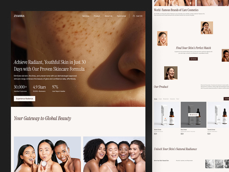
ZYAHRA - Skincare Ecommerce Landing Page
The ZYAHRA - Skincare Ecommerce Landing Page design, based on the visual provided, stands out as an elegant, effective, and user-friendly interface for promoting high-quality skincare products. Here's a case for its excellence:
1. Clean and Premium Design
The design is minimalist yet luxurious, which perfectly aligns with the skincare industry, where elegance and clarity are key to conveying trust and quality.
High-resolution imagery showcasing glowing skin immediately attracts attention and supports the product’s promise of youthfulness and radiance.
The harmonious color scheme, using soft, neutral tones, enhances the sophisticated feel while keeping the focus on the product and skin care benefits.
2. Compelling Value Proposition
The landing page communicates a strong, clear message about the product’s benefits: "Achieve Radiant, Youthful Skin in Just 30 Days."
Data points, such as "30,000+ satisfied customers," "4.9-star reviews," and "97% user satisfaction," immediately build trust and social proof.
3. Seamless User Experience
The "Experience Radiance" call-to-action button is prominent and encourages immediate interaction, inviting users to explore the product line effortlessly.
The navigation is streamlined, with options like "Services," "Product," and "About Us" easily accessible at the top, allowing users to find key information quickly.
4. Strategic Use of Testimonials
Featuring testimonials or reviews like “4.9 Stars” boosts confidence in potential buyers and positions ZYAHRA as a trusted, effective brand.
Displaying satisfied customer reviews and user ratings encourages others to feel comfortable investing in the skincare products.
5. Target Audience Alignment
The diverse range of models and skin types depicted in the visuals appeals to a broad audience, reinforcing inclusivity and the universal appeal of the skincare line.
The messaging is straightforward and aligned with what a modern, youthful audience (typically the primary skincare consumers) would look for: fast, visible results.
6. Ecommerce Functionality
The product section at the bottom is clean and easy to navigate, with product images and pricing clearly displayed, making it simple for users to add items to their cart.
Options to explore different product categories like "Serum," "Cream," "Moisturizer," etc., cater to a wide variety of customer needs, further enhancing the shopping experience.
7. Effective Conversion Strategy
The focus on guiding users towards the products and inviting them to take action ("Experience Radiance" and "Get Started") positions the page as an ideal tool for conversion.
By balancing content that emphasizes both beauty and science, the brand effectively appeals to both emotional and logical decision-making processes.
Conclusion
The ZYAHRA landing page design excels in delivering a professional, visually appealing, and conversion-focused experience. It is not only visually striking but also functional, designed to engage users and prompt them to explore products and make purchases.
Let's collaborate with us
🛍️ Download our Premium UI Kit on
Follow our pages and join the journey
Instagram | LinkedIn | Behance


