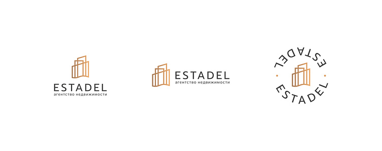
Logo for real estate agency «Estadel»
The project was developed in 2022 for Estadel, an agency specializing in the sale of luxury residential properties by the sea. The name of the company stands for Estate Citadel, where “Estate” is real estate and “Citadel” is the most protected part of the castle (city). Target audience of the company: 60-70% - women, 30-40% - men. The price segment is above average and luxury. It was required to develop a logo reflecting such characteristics as: mature, expensive, innovative, modern, serious, sophisticated, elegant, reliable. It was decided to combine 2 symbols in the icon. The wavy line denotes the sea, from it rise 3 houses of different heights at once. This combination helps to hint at the sphere of the company's activity, while maintaining the abstractness of the icon. In addition, the icon reads towers, referring to the meaning of the name - “Citadel”. Special attention is paid to the slope of the towers, which smoothly goes upward from left to right. This compositional technique symbolizes the growth of housing costs, which is especially relevant for a company focused on real estate investment projects.