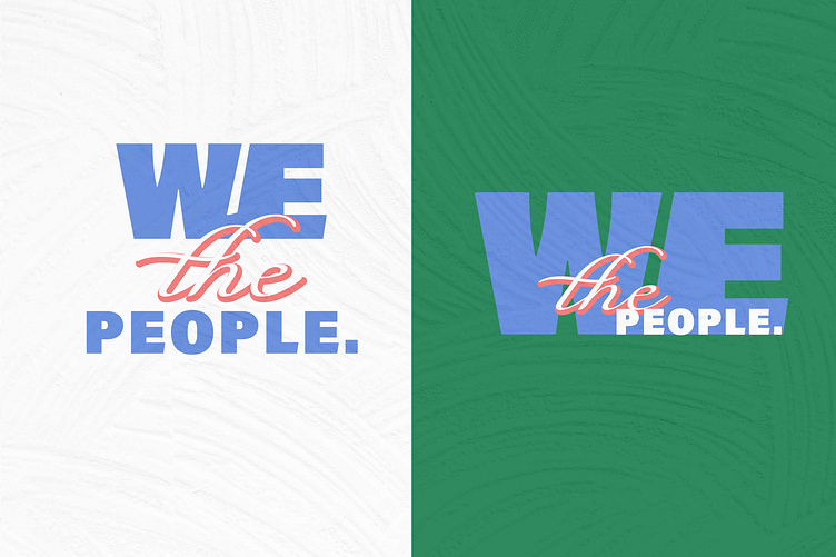
We the People Logo Design
For the church series identity design, 'We the People,' the visuals are bold and intentional, using a strong sans serif for 'We' and 'People' to convey unity and strength, balanced with a flowing, classic script for 'the' to evoke a sense of grace and tradition. The color palette follows an RGB parade format, allowing the phrase to be visually deconstructed into color building blocks—symbolizing how people are the foundational elements of America.
The most challenging part of the brief? Maintaining a politically neutral tone while still emphasizing the inclusive power of the message.
More by Krysteah Carroll View profile
Services by Krysteah Carroll
Like

