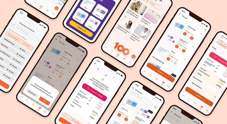
Vaxikart : making gsk vaccines accesible to healthcare
The challenge
Healthcare professionals (HCPs) were struggling with an outdated, manual process for ordering vaccines, which led to inefficiencies and a sharp decline in vaccine sales. GSK had developed an app to modernize the system, but poor UI/UX design resulted in only 3,000 out of 11,000 HCPs using it sporadically, contributing to a 70% drop in vaccine sales.
The solution
As the UI/UX designer, I focused on redesigning the app to address the needs of HCPs. By simplifying the interface and enhancing usability, we aimed to create a seamless experience that fit into the fast-paced workflow of healthcare professionals.
The outcome
As the UI/UX designer, I focused on redesigning the app to address the needs of HCPs. By simplifying the interface and enhancing usability, we aimed to create a seamless experience that fit into the fast-paced workflow of healthcare professionals.
Imagine being an HCP, working in a high-pressure environment where time is of the essence. You’re responsible for ensuring your patients have access to life-saving vaccines, yet the process for ordering them remains stuck in the past. Paper orders, phone calls, and face-to-face interactions were still the norm — methods that, while familiar, were time-consuming and inefficient.
GSK had developed an app meant to modernize this process. But when HCPs first began using it, the feedback was overwhelmingly clear: the app was clunky, unintuitive, and difficult to navigate. Out of 11,000 potential users, only 3,000 HCPs gave it a try, and even they quickly reverted to their old habits. The app, intended to simplify the process, was actually creating more barriers.
As a result, vaccine sales plummeted by 70%, severely affecting accessibility.My role was to reimagine the experience from the ground up, with the HCP’s needs at the core. I had to understand their daily challenges — fast-paced environments, limited time, and the need for a seamless workflow. By diving deep into user feedback and studying their pain points, I began reshaping the app into a tool that would fit effortlessly into their workday, rather than disrupt it.
The goal was simple: make the app as intuitive and accessible as possible, ensuring that HCPs could easily order vaccines with minimal effort. By focusing on usability and streamlining the interface, we aimed to increase engagement, sales, and, most importantly, vaccine accessibility.
This project was not just about fixing an app — it was about empowering healthcare professionals to better serve their patients by giving them the tools they needed to do their jobs more efficiently. And in doing so, we were able to turn things around, increasing both sales and usage, and ultimately improving the availability of essential vaccines.
Enter your text here...
My email : grvkmrpandit@gmail.com


